
7 Lesser Known Ways to keep visitors glued to your website
As a SaaS founder, indie hacker, or web agency owner, you know the painful truth of building an online business: driving traffic is only half the battle. The real challenge is figuring out how to keep visitors glued to your website long enough for them to realize the value of your product.
You've likely seen analytics dashboards showing traffic spikes followed by high bounce rates. Users land on your page, spend three seconds looking around, and hit the back button before they finish reading your headline. It's frustrating, expensive, and avoidable.
Today, users have zero patience for clunky layouts, confusing navigation, or generic aesthetics. If you want to turn passing traffic into paying customers, you need an experience that demands attention and builds trust.
Here are seven strategies to transform your high-bounce-rate pages into engaging experiences. From the psychology of first impressions to the technical details of modern animations, here is what you need to do to stop the bleed and start converting.
Key Takeaways
- Speed is essential: A delay of just a few seconds can increase bounce rates by over 30%.
- First impressions matter: Premium UI design and high-contrast typography immediately build trust.
- Interactive elements hook users: Micro-interactions and scroll-triggered animations create a feedback loop that keeps users engaged.
- Navigation must be easy: Stick to standard UX conventions so users never have to think about how to find what they need.
Table of Contents
- The Engagement Crisis: Why Users Leave So Fast
- 1. Nail the First Impression with Stunning UI
- 2. Deploy Micro-Interactions to keep your visitors hooked
- 3. Optimize Page Speed and Performance
- 4. Use Scroll-Triggered Animations to keep visitors interacting with your website
- 5. Streamline Your Navigation and User Flow
- 6. Make Your Content Scannable
- 7. Leverage Premium UI Components
- Frequently Asked Questions
- Final Thoughts: Stop Losing Traffic
The Engagement Crisis: Why Users Leave So Fast
Before we dive into the solutions, we need to understand the root of the problem. Why do users abandon websites so quickly?
According to user behavior research by HubSpot, the average bounce rate for a typical B2B website is over 60%. This means the majority of your visitors leave without clicking a single thing. If you do not capture their attention within the first 10 seconds, they are gone.
There are three primary culprits behind a high bounce rate:
- Poor Visual Hierarchy: The user does not know where to look or what action to take next. Everything on the screen is fighting for their attention.
- Performance Lag: The page takes too long to load, breaking the user's focus and causing frustration before the content even appears.
- Lack of Trust: The design feels cheap, outdated, or generic, causing the user to doubt your technical credibility and the quality of your product.
When you address these three issues, you create an environment where visitors feel comfortable, engaged, and ready to explore further. Let's look at how to achieve this.
1. Nail the First Impression with Stunning UI

Your hero section is the digital equivalent of a firm handshake. It sets the tone for the relationship moving forward. If your hero section looks like a basic template from a decade ago, visitors will assume your SaaS product or agency services are basic too.
To command attention, you need to invest in premium UI design. This does not mean cluttering the page with distracting elements; instead, it means embracing modern design principles:
- High-Contrast Typography: Use bold, legible fonts (like Inter or Plus Jakarta Sans) that communicate your core value proposition without requiring users to squint.
- Glassmorphism and Depth: Incorporate subtle shadows, blurred background layers, and gradients to create a sense of hierarchy and depth.
- Strategic White Space: Give your elements room to breathe. Visual clutter creates cognitive overload, which leads to page abandonment.
When a user lands on a site that looks like it was built with care, they trust the brand more. A stunning interface is the first step to ensure they stick around. If you are struggling to build these elements from scratch, using a UI component library can save you hours of design time while elevating your brand.
2. Deploy Micro-Interactions to keep your visitors hooked
Static websites belong in the early 2000s. Today, users expect digital interfaces that respond to their actions. This is where micro-interactions come into play.
Micro-interactions are subtle animations or visual state changes that occur when a user hovers over, clicks, or interacts with an element on the screen. They serve a psychological purpose: they provide immediate feedback, rewarding the user for their action.
Think about the feeling of a button that gently presses down when clicked, or a pricing card that slightly elevates and glows when hovered over. These tiny details might seem insignificant on their own, but collectively, they create a sense of polish and interactivity that is engaging.
By rewarding every hover and click with a smooth animation, you create a dopamine loop in the user's brain. This psychological loop is the secret weapon to keep your visitors hooked on exploring your interface. They want to see what happens when they click the next button or hover over the next feature card. It turns passive reading into an active experience.
3. Optimize Page Speed and Performance
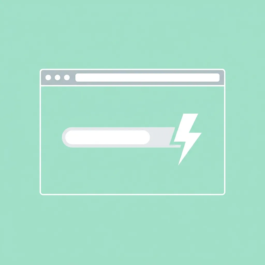
You can spend thousands designing a beautiful website, but if it takes five seconds to load, no one is going to stick around to see it. Speed is the silent killer of conversions and a leading cause of abandoned sessions.
Research from Google's Core Web Vitals team shows that as page load time goes from one second to three seconds, the probability of a bounce increases by 32%. If your site takes up to five seconds to load, that bounce probability shoots up to 90%.
To guarantee your site is fast and retains its audience:
- Optimize Visual Assets: Use modern image formats like WebP or AVIF instead of heavy PNGs or JPEGs. Compress them without losing quality.
- Lazy Load Content: Do not load images, videos, or heavy scripts below the fold until the user scrolls down to them.
- Minify Code Assets: Ensure your CSS and JavaScript files are optimized and as small as possible.
- Use Modern Frameworks: Building your site with static site generators or server-rendered frameworks like Next.js can improve your time-to-first-byte (TTFB) and rendering speeds.
An exceptionally fast website respects the user's time. When navigation feels instantaneous, the friction of exploring your site drops, extending session lengths.
4. Use Scroll-Triggered Animations to keep visitors interacting with your website
Scrolling is a continuation of the user journey, and you need to reward users for taking that journey down your page. Scroll-triggered animations are one of the best ways to maintain momentum as a user consumes your content.
Instead of presenting a static wall of text and images, have your content reveal itself naturally as the user scrolls. Elements can fade in, slide up, or stagger into place. This approach accomplishes two things:
- Paces the Information Delivery: It prevents the user from feeling overwhelmed by presenting information sequentially, exactly when they are ready for it.
- Creates a Narrative Flow: It makes the webpage feel like a story unfolding, rather than a corporate document being read.
When visual elements react to the user's scroll position, it creates a continuous feedback loop. This sense of progression is what you need to keep visitors interacting with your website. They will continue scrolling simply to see how the next section is going to reveal itself. It is a psychological trigger that increases time-on-page.
5. Streamline Your Navigation and User Flow

Confusion is the enemy of engagement. If a user has to stop and think about how to find your pricing page, how to log in, or how to contact your sales team, you have already lost their attention.
Your navigation should be intuitive enough that it feels invisible. For SaaS companies, indie hackers, and agencies, the top navigation bar should highlight the core product features, the pricing structure, the documentation, and a high-contrast Call to Action (CTA) button.
- Stick to UX Conventions: Do not try to reinvent the wheel with your navbar layout. Put the company logo on the left, the navigational links in the middle, and the primary CTA on the right. Users have ingrained mental models of how websites work; breaking these models causes friction.
- Use Mega-Menus Wisely: If you have a lot of product features or services, organize them in a dropdown menu rather than cluttering the top bar.
- Include Sticky Navigation: As users scroll down landing pages, keep a minimized version of the navbar pinned to the top of the screen so they can take action without having to scroll back up.
By removing friction from the navigational user journey, you make it effortless for them to transition from a reader to a prospect.
6. Make Your Content Scannable
Nobody reads websites like they read books. They scan them. They look for large headings, bulleted lists, and highlighted text to determine if the page contains the information they need.
If you present your visitors with massive blocks of unbroken text, their eyes will glaze over, and they will leave. To fix this, you need to engineer your content for scannability:
- Use Subheadings Generously: Break up your text with descriptive H2s and H3s every few paragraphs to guide the reader's eye.
- Keep Paragraphs Short: Aim for 3 to 4 sentences maximum per paragraph. Lots of white space makes reading feel less like a chore.
- Leverage Bullet Points: Whenever you are listing three or more items, use bullet points. They give the eye a natural place to rest.
- Highlight Key Takeaways: Use summary boxes, blockquotes, or callout sections to highlight the most crucial information on the page.
When content is easy to digest, users are more likely to consume the entire page. They will bounce from heading to heading, absorbing your core value proposition without feeling mentally exhausted.
7. Leverage Premium UI Components
We have talked about stunning design, micro-interactions, performance, and scroll animations. Implementing these features from scratch is a complex, time-consuming endeavor. It requires knowledge of animation libraries like Framer Motion, utility CSS frameworks like Tailwind CSS, accessibility standards (WCAG), and React state management.
For SaaS founders, indie hackers, and agency owners, spending weeks building a custom animated hero section or a pricing toggle is a massive drain on resources. Your time is better spent building your core product features and talking to customers.
This is the exact problem we solved when we built ogBlocks.
ogBlocks is a copy-and-paste React component library designed to solve the engagement and conversion problem for web developers. We have obsessed over the technical and design details so you do not have to. When you use ogBlocks, you get instant access to:
- Conversion-Optimized Layouts: Designed hero sections, feature grids, and pricing tables created to drive SaaS sales and agency leads.
- Flawless Animations: Smooth Framer Motion animations tuned for visual impact without sacrificing page speed or performance.
- Accessible Design: Components that look beautiful and work for all users, out of the box, ensuring you never alienate a potential customer.
If you want to build interfaces that captivate your audience, reduce your bounce rates, and drive revenue, buy ogBlocks today and transform your web presence in minutes, not months.
Frequently Asked Questions
Why is my website bounce rate so high? A high bounce rate almost always indicates a mismatch between user expectations and reality, or a poor user experience. Common causes include slow page loading times, confusing navigation, poor mobile responsiveness, or a dated UI design that fails to build trust.
How do I make my SaaS website more interactive and engaging? You can increase interactivity by adding hover states to buttons and feature cards, implementing scroll-reveal animations as users move down the page, using interactive pricing sliders instead of static tables, and adding background visual effects. Using a component library with built-in Framer Motion support is the easiest way to achieve this.
Are website animations bad for SEO rankings? No, modern animations are not inherently bad for SEO, provided they do not negatively impact your page load speed (specifically your Core Web Vitals) and the content remains accessible to search engine crawlers. Modern CSS transitions and libraries like Framer Motion are highly performant and SEO-friendly when implemented correctly.
Final Thoughts: Stop Losing Traffic
Driving qualified traffic to your website is hard work. You spend hours optimizing for SEO, running social media marketing campaigns, and fine-tuning paid ads just to get eyes on your product. Do not let all of that effort go to waste by sending visitors to a landing page that fails to convert.
By implementing these seven strategies (focusing on speed, scannability, interactivity, and premium visual design) you can transform your digital user experience. Remember, the goal is not just to make things look pretty; it is to build a trustworthy environment where users feel confident taking the next step.
Stop settling for generic templates that leak traffic and cost you money. Upgrade your interface, elevate your brand perception, and watch your conversion rates soar. Start building better experiences today to keep visitors glued to your website with the help of ogBlocks.
Written by Karan
Karan is a React engineer and the founder of ogBlocks, building high-performance UIs for SaaS.