Steal These 5 SaaS Landing Page Best Practices for Explosive Growth
Key Takeaways
- Nail the Header: Your H1 needs to clearly explain what you do and who you do it for, instantly. No fluff. Clear, concise value proposition in the hero drives engagement.
- Problem First, Solution Second: Don't just list features. Remind your audience of their painful operational challenges before showing them how your product solves it.
- Social Proof is Non-Negotiable: Use grayscale logos from reputable companies early on the page. Authority builds trust instantly.
- Design Drives Conversions: A clunky SaaS landing page will tank your conversion rate and increase your CAC. Using a library like ogBlocks ensures a polished, minimalist look right out of the box.
- Clear Multiple CTAs: Always give users a prominent primary CTA (Start Trial) and an alternative secondary CTA (Book a Demo) to respect their buying stage.
Table of Contents
- The Anatomy of a High-Converting SaaS Landing Page
- Nailing Your Value Proposition in the Header
- Social Proof: Building Trust Instantly
- Introduce the Problem Before the Solution
- How It Works (Features vs. Benefits)
- Clear and Compelling Calls to Action (CTAs)
- Why Speed and Design Matter More Than Ever
- Pro Tip: Elevating Your SaaS UI with ogBlocks
- Complete Summary
- Frequently Asked Questions
Hey SaaS founders! 👋 If you've been pouring thousands of dollars into paid ad campaigns, constantly tweaking audience parameters, or spending countless hours refining your technical SEO, only to see website visitors bounce without signing up, you're not alone. Welcome to the ever-expanding club of frustrated founders.
The cold, painful truth of building software in 2026 is that no amount of perfectly targeted traffic will save a poorly designed, confusing, or untrustworthy website. Your landing page is your digital storefront. It’s your most tireless 24/7 salesperson, and fundamentally, your primary organic growth engine.
If your core web pages aren't converting, your customer acquisition cost (CAC) will bleed your margins dry over time. But don't panic. By implementing proven, deeply researched SaaS landing page best practices, you can radically transform your site's conversion rates, systematically lower your CAC, and scale your active user base with far less operational friction.
In this ultimate, comprehensive guide, we'll break down step-by-step how to architect, design, and structure a high-converting SaaS landing page that actually works. We are throwing away the academic theories. We're talking about actionable, battle-tested strategies and proven copywriting techniques that turn highly skeptical, passive visitors into loyal, paying enterprise users.
The Anatomy of a High-Converting SaaS Landing Page
When it comes to building high-converting landing pages, architecture and structure are absolutely everything. You can't just throw an attractive mix of features, flashy buttons, and dense pricing tables onto a blank canvas and hope for the best.
A high-converting SaaS landing page guides the user through a highly structured, logical, and deeply psychological journey. It anticipates their skepticism. It answers their internal objections before they even vocalize them. To maximize conversions, follow this specific, top-to-bottom structural flow that has been proven by the highest-grossing B2B SaaS companies:
- The Header (Value Proposition): Instantly establish what you do.
- Initial Social Proof (Logos): Prove you are legitimate.
- Introduce the Problem (Agitate): Validate their pain and frustration.
- How It Works (The Solution): Show the bridge from pain to paradise.
- Show Them How to Use It (Use Cases): Demonstrate real-world application.
- Deep Social Proof (Testimonials / Case Studies): Provide peer-level validation.
- Final CTA (Pricing / Sign Up): Capture the ready-to-buy intent.
- Alternative CTA (Book a Demo): Capture the hesitant enterprise buyer.
Let's dive incredibly deep into each of these core components and look at the best practices to optimize them for 2026 traffic patterns.
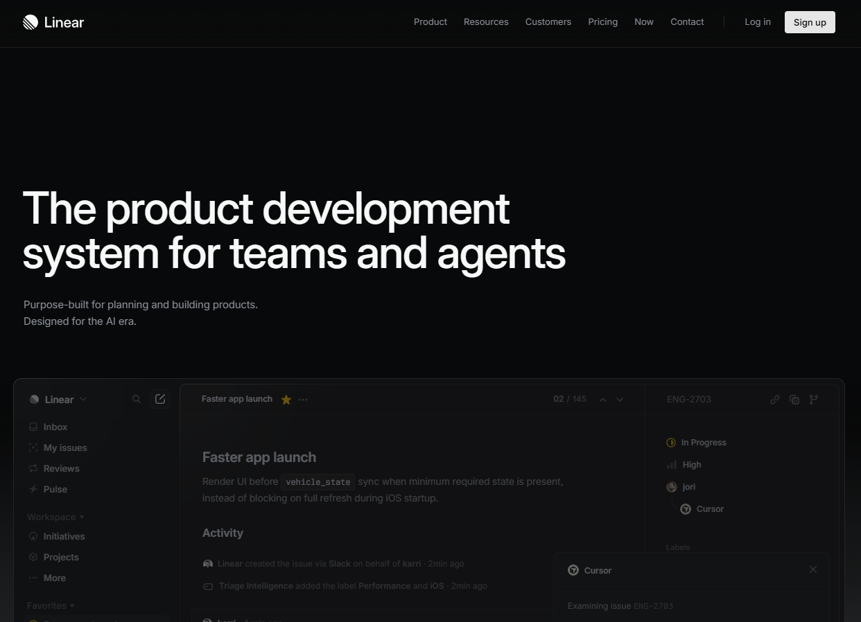
1. Nailing Your Value Proposition in the Header
The header (often called the hero section) is the most critical digital real estate on your entire website. It's the absolute first thing visitors see, and data suggests you have exactly 3 to 5 seconds to convince them to scroll down instead of clicking the back button.
In a world plagued by microscopic attention spans and infinite browser tabs, your hero section must immediately and unequivocally answer two essential questions:
- "What exactly is this product?"
- "What explicit value is in it for me?"
The Anatomy of a Perfect Hero Section
- The H1 Headline: Keep it punchy, benefit-driven, and crystal clear. Avoid clever marketing buzzwords that obscure meaning. Saying "We build synergistic multi-cloud ecosystems" means absolutely nothing to a stressed buyer. Instead, say: "Automate your global payroll in under 5 minutes."
- The Sub-headline: This is your supporting text, doing the heavy lifting to bridge the headline and button. Use a short paragraph (approximately 2-3 sentences) to briefly elaborate on the bold H1 promise and explain how your technology actually delivers that benefit.
- The Primary CTA: Don't hide the button. Make it pop with a highly contrasting brand color that stands out from the background. Use action-oriented, personalized text like "Start Your Free Trial," rather than passive text like "Submit" or "Learn More."
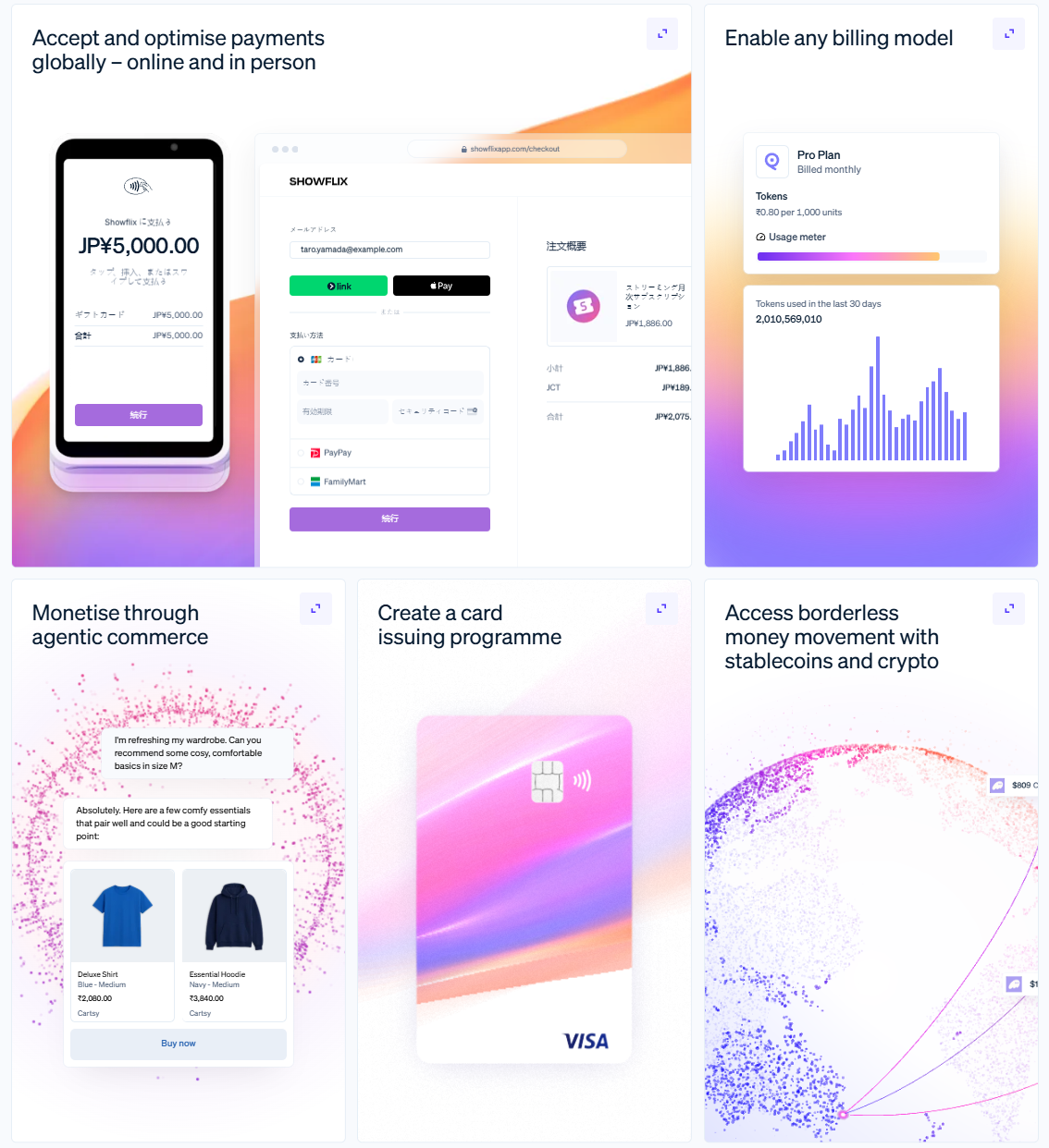
- The Visual Preview: People rarely read every single word on a webpage, but their eyes are inherently drawn to images. Include a clean, high-fidelity screenshot, a dashboard mockup, or an interactive, animated web component that shows exactly what your software looks like in action.
As one of the core saas landing page best practices, your central value proposition should promise a substantially better, easier life for the user, not just a monotonous list of technical architectural capabilities.
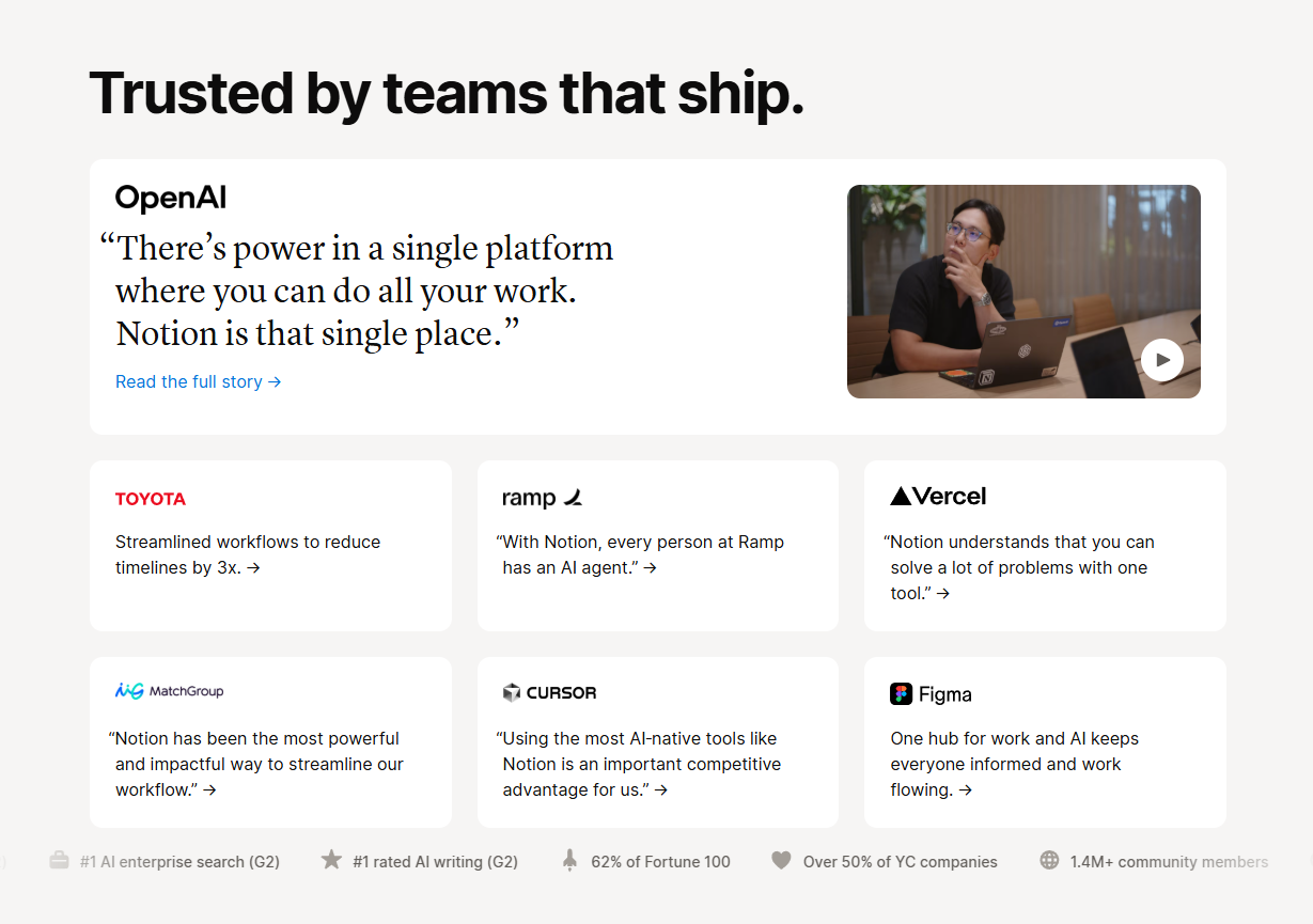
2. Social Proof: Building Trust Instantly
Once you've initially hooked visitors with your powerful header, you face a new hurdle: skepticism. You need to prove that your company is a robust, reliable entity and not just a weekend project built by two guys in a basement.
Enter: Initial Social Proof.
Immediately below your hero section, strategically place a clean, minimalist horizontal strip of your most impressive customer logos. This is your chance to leverage "borrowed authority"—using the established reputation of well-known brands that already trust and utilize your product.
Best Practices for Initial Social Proof
- Keep it Grayscale or Monochromatic: You want the logos to be recognizable at a glance, but you don't want a chaotic rainbow of clashing brand colors distracting the user's eye from your own CTAs and messaging. Convert all customer logos to a standardized grayscale, low opacity, or monochromatic theme that matches your brand palette.
- Add a Trust Metric: Don't just slap logos on the screen without context. Precede them with a compelling microcopy snippet like, “Trusted to process $2B+ by 4,000+ forward-thinking teams” or “Loved by product teams at industry-leading companies.”
- Prioritize Industry Relevance: If your software is explicitly built for digital marketing agencies, show top-tier agency logos. If you are targeting enterprise healthcare, show major hospitals. The user needs to experience a moment of recognition: "Oh, they work with companies just like mine. If those guys trust them, I can too."
When observing a highly successful saas landing page, notice how effortlessly they implement this. It instantly neutralizes subconscious objections regarding your legitimacy and stability.
3. Introduce the Problem Before the Solution
This is arguably where 90% of SaaS founders and technical marketers get it wrong. They are so incredibly proud of the software they've built that they immediately jump straight into listing their features. Big mistake!
Before you show them the shiny new solution, you need to deliberately remind them of the agonizingly painful problem they currently face in their day-to-day operations. People don't buy enterprise software just for fun; they buy a permanent way out of an expensive, time-consuming pain. If you don't vividly describe their current struggles, they won't value your ultimate solution.
How to Agitate the Problem
- Use Polarizing, Empathic Headlines: Don’t be afraid to be vividly bold. Instead of calmly stating, "We make data entry fast," agitate the pain by saying: "Stop wasting 15 agonizing hours every week manually entering data into messy, broken spreadsheets."
- Leverage Hard Statistics: If you possess industry data showing exactly how much time, revenue, or employee morale the industry loses due to this specific problem, use it! It rationalizes the emotional pain with logical data and naturally elevates the perceived financial value of your SaaS.
- Visually Represent the Current Chaos: Use a graphic, icon, or abstract illustration that visually represents their current chaotic state: a messy, overflowing inbox, a spaghetti-web of broken API integrations, or an endlessly delayed task pipeline.
By employing this proven saas best practices technique, your target customers will feel profoundly understood. They will think, "Wow, these guys really get exactly what my team is going through right now." Empathy creates profound connection, and connection opens their wallets.
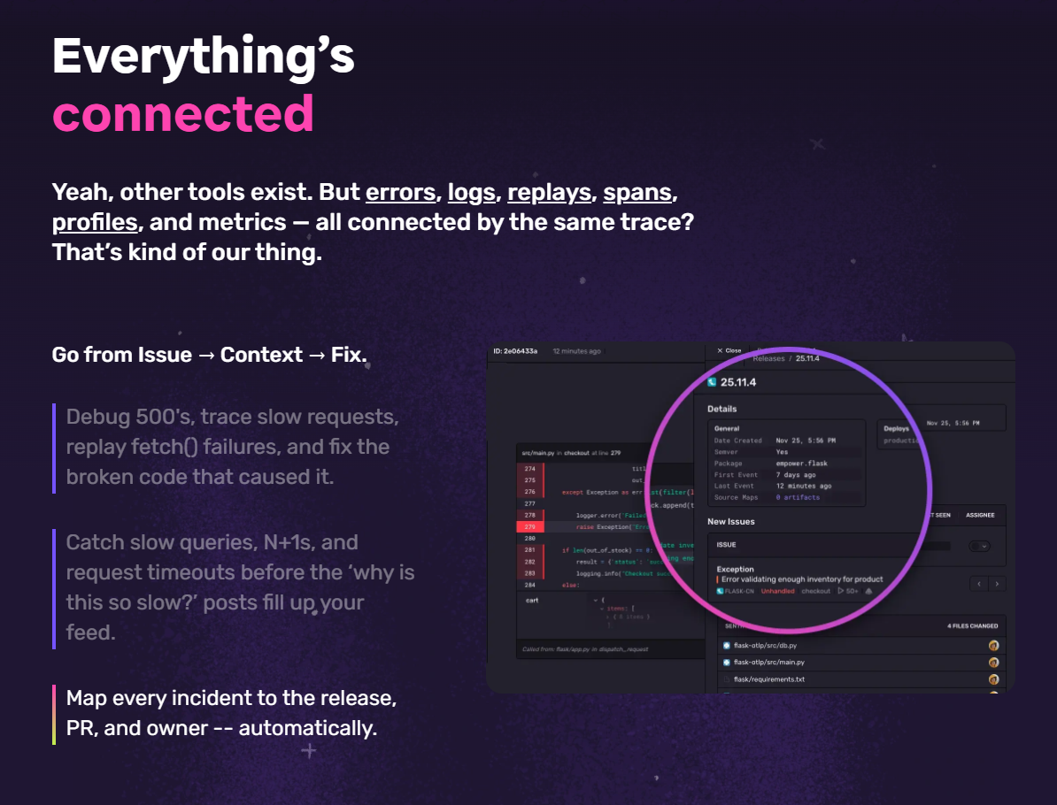
4. How It Works (Features vs. Benefits)
Now that they are fully aware of their problem and their frustration is peaked, it's time to play the hero. Introduce your product as the ultimate, stress-relieving, perfectly engineered solution.
However, you must frame this section entirely around the end-user benefits, rather than diving too deeply into the raw technical features.
The Critical Difference Between Features and Benefits
- Feature (Technical): Our database architecture utilizes 256-bit AES encryption with multi-region AWS redundancy.
- Benefit (Emotional): Sleep soundly every single night knowing your sensitive customer data is absolutely safe from hackers and guaranteed to never go offline.
Structuring the "How It Works" Section
- Keep it to 3 or 4 Simple Steps: Break down complex, enterprise-grade software into a highly simplified 3-step process. People want ease. For example: "1. Integrate in seconds via our API. 2. Set your custom routing rules. 3. Watch the automated magic happen."
- Use Premium Iconography or UI Snippets: Break up dense paragraphs of text using high-quality bespoke iconography or actual, beautifully zoomed-in snippets of your application's UI. Show, don't just tell.
- Focus on Seamless Integrations: Reinforce your benefits by prominently highlighting how your tool plugs effortlessly into the software stack they already depend on (e.g., Slack, Stripe, Salesforce, Hubspot).
Remember, fundamentally, nobody wants to learn a new piece of software. It represents work. They want the spectacular result the software provides. Your landing page must portray your product as the fastest, easiest bridge between their current painful state and their deeply desired future state.
5. Clear and Compelling Calls to Action (CTAs)
So, your audience is actively engaged, deep trust has been established via social proof, and they viscerally understand the value of your benefits. Now, you need to seamlessly close the deal.
Your final Call to Action (CTA) section is the climax of your SaaS landing page journey. If this section is cluttered, anxiety-inducing, or confusing, you will lose the lead at the finish line.
Best Practices for Your Closing CTA Layout
- Clarify the Immediate Next Steps: What exactly happens the moment they click that bright button? Do they get instant dashboard access? Do they need to pull out a credit card? Be extremely explicit to radically reduce friction and anxiety. Use reassuring microcopy underneath the button like, "No credit card required. Setup takes exactly 2 minutes."
- Offer an Alternative, Low-Friction CTA: The reality of SaaS is that not everyone is ready to buy right now. Some visitors have complex, enterprise-level security objections, or they simply aren't the sole decision-makers with the corporate card. Offering an alternative, lower-friction CTA like "Book a Demo" or "Talk to a Technical Expert" ensures you still capture those high-value leads instead of letting them bounce forever.
- Maintain High Visual Contrast: Just like in the hero section, your final CTA buttons must contrast sharply with the background canvas, drawing the user's eye directly to the action you desperately want them to take.
Why Speed and Design Matter More Than Ever
We've covered the critical psychological triggers and structural elements of saas landing page best practices, but we must address the massive elephant in the room: Technical Performance and Design Fidelity.
You can have the most persuasive, masterfully written copywriting in the world, but if your landing page looks like a relic built in 2010 or takes a frustrating 8 seconds to fully render, your hard-earned credibility is instantly destroyed.
Users inherently associate the visual and technical quality of your landing page with the quality of your actual software product. A janky, unpolished landing page subconsciously tells the enterprise buyer, "Our backend infrastructure is probably as slow, buggy, and unreliable as this webpage."
To ruthlessly win in the fiercely competitive modern SaaS landscape, you need buttery-smooth page transitions, lightning-fast Core Web Vitals, pixel-perfect UI layouts, and engaging micro-interactions.
Pro Tip: Elevating Your SaaS UI with ogBlocks
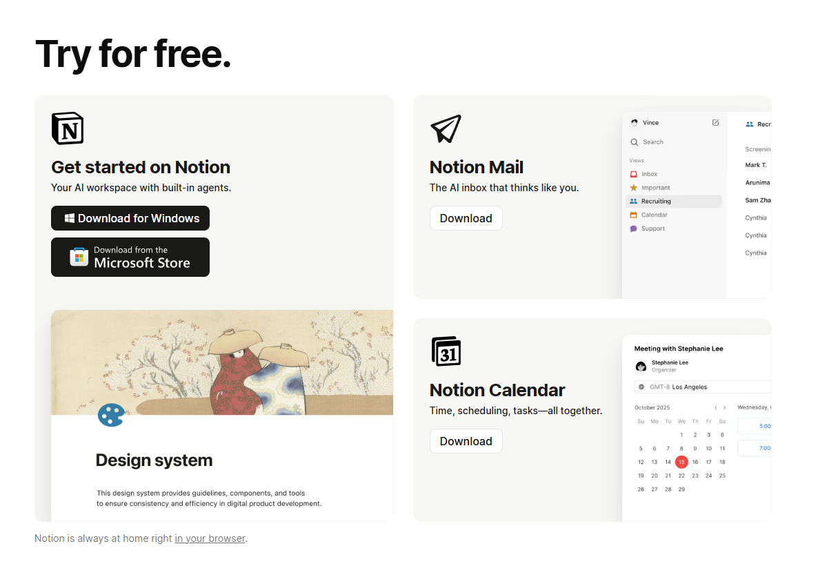
ogBlocks is the ultimate, premium React UI component library designed specifically for ambitious SaaS founders, product teams, and frontend developers. Built meticulously with React, Tailwind CSS, and Framer Motion, it gives your team instant, copy-paste access to production-ready, highly accessible, and visually breathtaking web components.
Instead of writing thousands of complex lines of code and wrestling with math to get that perfect framer-motion scroll effect, you simply drop a beautifully crafted ogBlocks component straight into your Next.js or Vite codebase in mere seconds.
Whether you need a dynamic, high-converting pricing card that handles annual toggles, or an interactive, physics-based animated Feature Section that wows enterprise clients, ogBlocks Pro is the absolute secret weapon to skyrocketing your conversion rates.
Stop losing expensive organic leads and paid traffic to boring, static, generic web design.
👉 Upgrade your SaaS landing page experience with ogBlocks Pro today.
Complete Summary
Designing the perfect, highest-converting SaaS landing page requires a dedicated, empathetic focus on the prospect's psychological journey. By strictly adhering to these core Saas landing page best practices developed by industry leaders, you position your software brand as highly authoritative, deeply user-centric, and entirely indispensable:
- Hit them with a clear, concise, and incredibly benefit-driven value proposition above the fold.
- Establish authority immediately with recognizable social proof and concrete trust metrics.
- Agitate their core operational problem deeply before you unveil your shiny features.
- Translate every complex technical feature into a tangible, emotional, real-world benefit.
- Provide clear, frictionless primary CTAs while always offering a secondary alternative option for cautious, enterprise-level buyers.
- Invest heavily in premium, animated frontend design and lightning-fast performance to establish immediate brand trust within seconds.
Frequently Asked Questions
What should be the main focus of a SaaS landing page hero section?
The hero section must instantly answer what your product practically does and how it improves the user's daily life. It should feature a highly readable H1 headline, a short supporting paragraph, a high-contrast primary CTA button, and a visual preview of the software dashboard to ground the product in reality.
Why is it incredibly important to introduce the problem before the solution on a landing page?
By actively agitating a specific operational problem your audience faces, you demonstrate deep empathy and profound industry understanding. This vividly reminds the prospect of their pain points, making your subsequent software features appear infinitely more valuable, urgent, and necessary compared to viewing features in a vacuum.
How many Calls to Action (CTAs) should a comprehensive SaaS landing page have?
While your primary CTA (e.g., "Start Your Free Trial") should be highly prominent in the header, body, and the footer, it's highly recommended to seamlessly integrate a secondary, lower-friction CTA (like "Book a Demo", "Calculate ROI", or "Watch a Video"). This captures users who are interested in your solution but simply aren't yet ready to commit to an account creation flow.
How does landing page design impact SaaS conversion rates and customer acquisition?
Design fidelity is directly and inextricably correlated to user trust. A modern, minimalist landing page equipped with smooth micro-animations signals to the buyer that the software itself is high-quality, modern, and exceedingly reliable. Poor, outdated design drastically increases your bounce rates and subsequently drives up your customer acquisition costs (CAC).
Can using pre-built React UI components genuinely improve my SaaS landing page?
Absolutely. Leveraging a premium UI component library like ogBlocks allows your lean engineering team to implement stunning, robustly animated, and highly optimized landing page elements in minutes. This strategy ensures you achieve a premium, enterprise-ready aesthetic without the massive, expensive time sink of custom frontend development.
Written by Karan
Karan is a React engineer and the founder of ogBlocks, building high-performance UIs for SaaS.