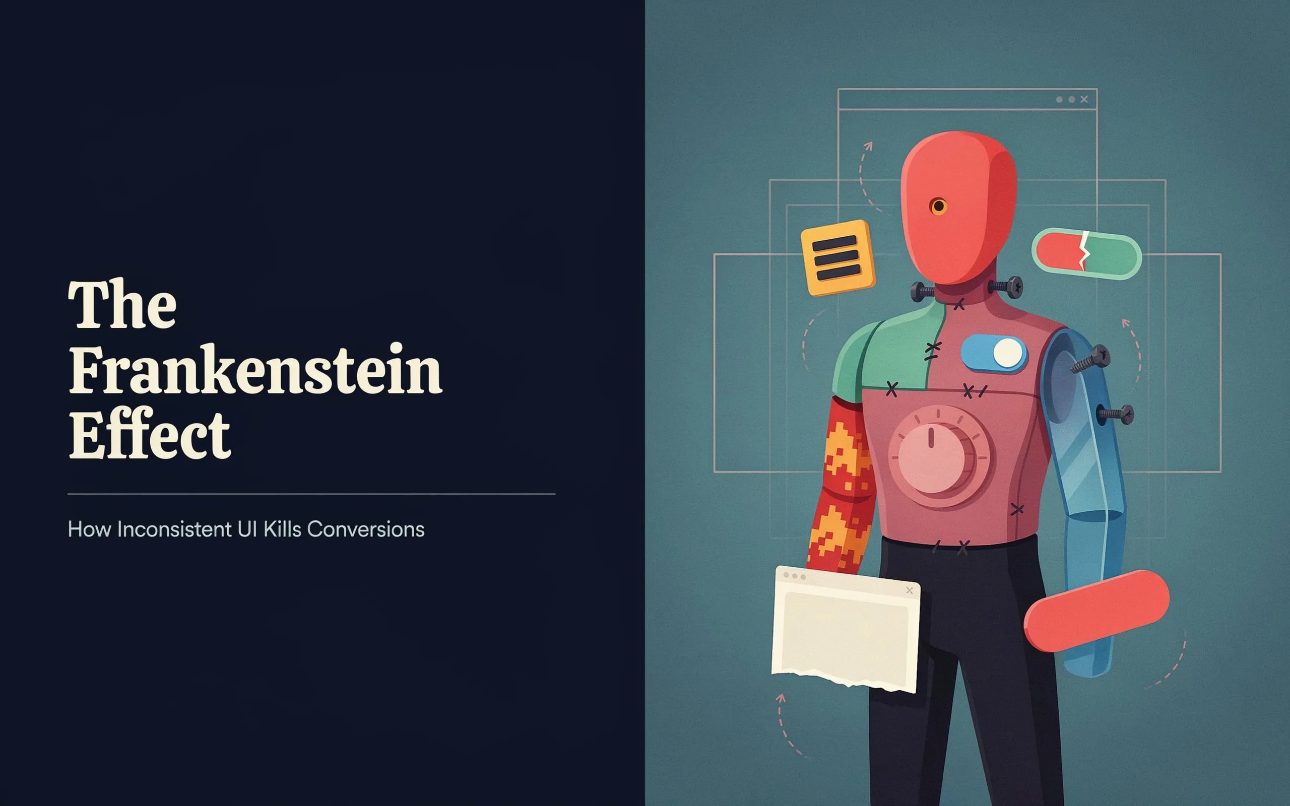
The Frankenstein Effect: How Inconsistent UI Kills Conversions
You might have an incredible SaaS product, but if your interface looks like a patchwork of mismatched components, you are driving customers away. Inconsistent UI quietly kills conversions.
We are going to look at the Frankenstein UI Problem, explain why it shatters user trust, and show you how to fix it. This guide is for SaaS founders, indie hackers, and web agency owners who want to turn a disjointed interface into a high-converting product.
Key Takeaways
- Trust is Fragile: Users judge your site's credibility in 50 milliseconds. Inconsistent design damages that trust immediately.
- The Frankenstein UI Problem: Stitching together mismatched buttons, fonts, and colors creates confusion and increases bounce rates.
- Cognitive Load Kills Sales: When a user has to figure out how a new button works, friction goes up and conversion rates drop.
- Design Systems Work: Using a unified design system or a premium library like ogblocks enforces consistency.
- Audience Alignment: Agency owners and indie hackers face different UI challenges, but both lose revenue when they ignore consistency.
Table of Contents
- What is the Frankenstein UI Problem?
- Why Inconsistent UI Ruins User Trust
- The Financial Cost of Bad Design
- Common Causes of the Frankenstein UI Problem
- How Inconsistency Impacts Different Creators
- How to Fix Your UI and Boost Conversions
- The Ultimate Solution: ogblocks
- Frequently Asked Questions
What is the Frankenstein UI Problem?
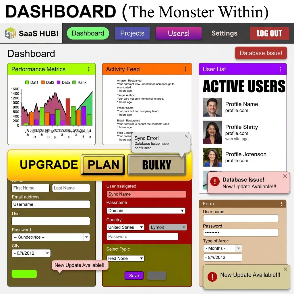
Imagine landing on a website. The homepage has sleek, rounded buttons with a modern gradient. You click through to the pricing page and find sharp-edged, flat buttons using a different shade of blue. The fonts switch from Inter to Times New Roman. The padding is chaotic.
This is the Frankenstein UI Problem.
This type of interface is stitched together from unrelated parts. It happens when developers, designers, or third-party plugins inject their own styles into your application without following centralized rules. Design uniformity is the backbone of a brand identity. Without it, you deliver a confusing user experience.
Why Does It Happen?
Moving fast is the priority for many indie hackers and SaaS founders. You grab a component from an open-source library, copy a snippet from a tutorial, and write custom CSS for another section. Before long, you have 14 different button styles and 7 shades of gray.
Shipping your MVP faster this way creates massive technical and design debt. It feels like trying to read a book where every page is written in a different language. It is just annoying.
| Metric | Inconsistent UI (Frankenstein) | Unified Design System |
|---|---|---|
| User Trust | Low (Appears unprofessional) | High (Credible & secure) |
| Cognitive Load | High (Confusing navigation) | Low (Predictable patterns) |
| Development Time | Slow (Custom CSS everywhere) | Fast (Reusable components) |
| Conversion Rate | Poor (High bounce rate) | Excellent (Frictionless flow) |
Why Inconsistent UI Ruins User Trust

If you want someone to hand over their credit card details or commit to a monthly subscription, they need to feel safe.
According to research from Stanford University, 75% of users judge a company's credibility based on its website design. When they encounter visual inconsistency, red flags go up.
It Looks Unprofessional
Users subconsciously assume your backend, security, and customer service are as chaotic as your UI. They think: If they cannot even get their buttons to match, how can I trust them with my data? It is a harsh judgment, but it happens instantly.
When buttons are placed randomly, fonts are mismatched, and colors clash, users will not trust your brand. They will leave and take potential sales with them.
Increased Cognitive Load
Consistent design relies on familiar patterns. When a user learns your primary action button is blue and located on the bottom right of a card, they should not have to relearn that pattern on the next page.
Inconsistent UI forces users to think too much. This increased cognitive load causes frustration. If a user has to pause and wonder if a text link is actually a button, you have introduced friction. Friction stops conversions.
The Financial Cost of Bad Design
Inconsistent UI directly impacts your Monthly Recurring Revenue (MRR).
If your site gets 10,000 visitors a month and your conversion rate drops from 3% to 1.5% because of a disjointed user experience, you lose 150 customers every month. If your Lifetime Value (LTV) is $500, that is $75,000 lost.
The Bounce Rate Reality
Users are impatient. A study by Google found that as page load time goes from 1 second to 3 seconds, the probability of a bounce increases by 32%. Visual processing works even faster. If the visual hierarchy is broken, users will bounce before they read your headline. You might spend thousands on Google Ads or SEO, only to lose visitors because your interface looks outdated.
Common Causes of the Frankenstein UI Problem
Here are the most common reasons web agency developers and SaaS founders end up with a fragmented UI:
- Lack of Planning: Jumping straight into code without a wireframe or design plan.
- Lack of Design Patterns: Failing to establish basic rules for interactions, hover states, and focus rings.
- Siloed Teams: When the marketing team builds the landing page on Webflow and the dev team builds the app in React, the transition feels like visiting two different companies.
- Design Team Turnover: A new designer comes in and implements their own style, ignoring existing work.
- Ignoring User Expectations: Disregarding standard web conventions confuses users. For example, users expect the logo in the top left and the cart in the top right.
- Skipping User Research: Failing to test how real users interact with your interface means you miss major friction points.
How Inconsistency Impacts Different Creators
The Frankenstein UI problem hits different types of businesses in unique ways.
SaaS Founders
Churn is the ultimate enemy for SaaS founders. You work hard to acquire a user. If the dashboard experience feels disconnected from the marketing website that sold the product, buyer's remorse sets in. Inconsistent UI makes software feel buggy. This reduces perceived value and leads to higher cancellation rates.
Indie Hackers
Indie hackers often build everything from marketing to backend infrastructure themselves. Because they wear so many hats, design is sometimes treated as an afterthought. You might cobble together Tailwind UI components with custom CSS and a random pricing table template. This setup signals to potential users that the tool is a side project rather than a professional product.
Web Agency Developers and Owners
Your portfolio is your livelihood. Delivering a website to a client with inconsistent UI damages your reputation. Trying to scale your agency by reusing code snippets from past projects without a proper component library creates a maintenance nightmare. A unified design system is the only way to scale an agency profitably.
How to Fix Your UI and Boost Conversions
Here is how you can transform a chaotic interface into a trustworthy and high-converting experience.
1. Conduct a UI Audit
Take screenshots of every core page in your user journey. Put them side-by-side in Figma or FigJam. You will spot the inconsistencies immediately. Look for:
- How many different button styles are you using? Stick to 3 or 4 variations.
- Are your input fields identical across all forms?
- Is your typography scale consistent?
- Are you using 12 different shades of blue?
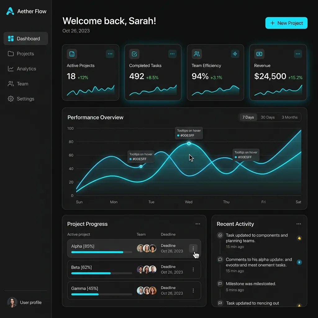
2. Establish a Single Source of Truth
You need a design system. You do not need to spend six months building a massive Google Material Design clone. Just define your core design tokens:
- Colors: Primary, secondary, success, danger, warning, and neutral shades.
- Typography: Font families, sizes, and weights for headings, body text, and small text.
- Spacing: A consistent scale for padding and margins.
- Border Radius: Decide if your brand uses sharp edges, slight curves, or pill shapes, and stick to it.
3. Keep Button Placement Intuitive
Users should not have to hunt for the submit button. Follow standard UX conventions. Primary actions should stand out with a solid background color. Secondary actions should be outlined or ghost buttons. Keep them aligned exactly where users expect them to be.
4. Consolidate Your Components
Stop building components from scratch every time you need a new feature. Create reusable components for buttons, modals, cards, and navigation bars. Updating a primary color in one place should update it everywhere. Good designs use simple design patterns and avoid unnecessary elements.
The Ultimate Solution: ogblocks
Building a comprehensive, accessible design system from scratch takes hundreds of hours. SaaS founders, indie hackers, and agency owners need to spend time building core products and talking to customers.
To solve the Frankenstein UI problem, you need a cohesive foundation. ogblocks is a component library designed for web developers who want aesthetics and consistency.
Why ogblocks Works
- Consistency: Every component in the ogblocks library is designed to work perfectly together. Clashing styles and broken layouts are eliminated.
- Premium Aesthetics: ogblocks delivers modern, vibrant micro-animations out of the box. Your app will feel state-of-the-art.
- Drop-in Ready: Built for React and Next.js. You can drop these components into your app and elevate the user experience instantly. The code stays clean.
- Time Saver: Skip the CSS tweaks, media queries, and cross-browser testing. We did the heavy lifting so you can ship faster.
When your UI feels polished, users stay longer, engage more, and trust your brand. Your design is your reputation.
Stop losing customers to bad design. Buy the ogblocks component library today and watch your conversion rates improve. Implementing a premium UI kit eliminates the Frankenstein UI problem entirely.
Frequently Asked Questions
What is the Frankenstein UI problem?
The Frankenstein UI problem occurs when a website or app uses mismatched design elements, creating a disjointed user experience. This inconsistency often results from multiple designers or developers working without a unified design system.
How does inconsistent UI kill conversions?
Inconsistent UI kills conversions by reducing user trust, increasing cognitive load, and making navigation confusing. When users encounter clashing colors or unpredictable buttons, they often abandon the site before completing a purchase.
Why is design consistency important for SaaS?
For SaaS platforms, trust is essential. A consistent design reassures users that your software is reliable, secure, and professionally maintained, which directly influences their willingness to subscribe.
How can I fix inconsistent UI on my SaaS platform?
You can fix inconsistent UI by implementing a strict design system, auditing your current interface for mismatched elements, and using a premium component library like ogblocks to maintain visual harmony across all pages.
Are UI libraries worth the investment?
Absolutely. Investing in a premium UI library like ogblocks saves hundreds of hours of development time and prevents the revenue loss associated with poor user experience and inconsistent design. It is the fastest way to achieve professional consistency.
Written by Karan
Karan is a React engineer and the founder of ogBlocks, building high-performance UIs for SaaS.