
How to Make Your Website Look Premium (Without Hiring a Design Agency)
Key Takeaways
- Whitespace is a weapon. Strategic whitespace is the single fastest way to make your website look premium. Crowded layouts instantly signal "cheap" to visitors.
- Typography hierarchy drives perceived quality. Pairing a clean sans-serif with deliberate font size ratios (1.25–1.5 scale) creates instant visual authority.
- Motion design separates amateurs from pros. Subtle, physics-based micro-animations using tools like Framer Motion create a polished, "alive" experience that static pages can't match.
- Color restraint beats color variety. Top-tier SaaS sites use 2–3 core brand colors maximum. Vibrancy comes from contrast, not quantity.
- Component consistency builds subconscious trust. Reusing uniform UI elements (buttons, cards, navbars) across your site signals professionalism. A library like ogBlocks gives you this consistency out of the box.
Table of Contents
- Why "Premium" Design Actually Matters for Revenue
- The 7 Principles That Make a Website Look Premium
- Whitespace: The Free Upgrade
- Typography That Commands Attention
- A Disciplined Color Palette
- Micro-Animations and Motion Design
- Visual Hierarchy and Layout Grid
- Consistent, High-Quality UI Components
- Photography, Imagery, and Social Proof
- The Fastest Way to Ship a Premium Website
- Putting It All Together: A Quick Before/After Checklist
- Frequently Asked Questions
You know the feeling. You land on a website and within two seconds you can tell whether it was built by a seasoned product team or slapped together over a weekend. That gut reaction, "this feels premium" or "this feels cheap," is worth millions in trust, conversions, and retention.
This article is for SaaS founders, indie hackers, and web agency developers who want their websites to radiate the same level of polish as Stripe, Linear, or Vercel, without burning $30,000 on a design agency retainer. We're going to break down the exact visual principles that make a website look premium and, more importantly, show you how to implement them today.
If you've ever wondered how to make your website look premium on a lean budget, you're in the right place.
Why "Premium" Design Actually Matters for Revenue
Let's address the elephant first: does premium design actually move the needle?
According to a Stanford Web Credibility Study, 75% of users admit to judging a company's credibility based on their website design. Adobe's State of Content report found that 38% of visitors will stop engaging with a website if the layout is unattractive. And for SaaS specifically, Paddle's 2025 benchmark showed that well-designed SaaS landing pages convert at 3.2% to 5.8%, while poorly designed ones struggle to breach 1%.
The takeaway is brutally simple: your website design is not a cosmetic luxury. It's a revenue lever. When a visitor subconsciously thinks "this looks professional," they are far more likely to trust your product, complete a signup, or pull out their credit card. Premium design reduces friction in every step of the buying journey.
Now, let's get into the practical principles.
The 7 Principles That Make a Website Look Premium
After analyzing hundreds of top-converting SaaS sites and studying design systems from companies like Apple, Stripe, and Linear, these are the seven non-negotiable principles that create a premium look.
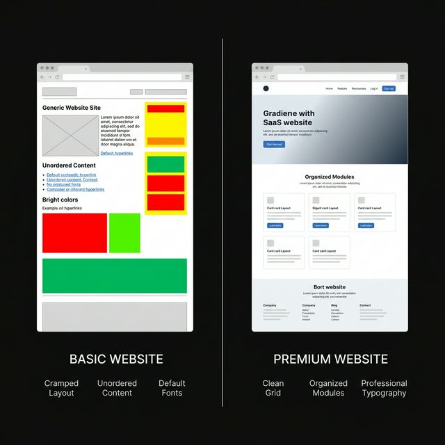
1. Whitespace: The Free Upgrade
This is the single most underrated design principle, especially among technical founders. Whitespace (also called negative space) is the empty space between text, images, buttons, and sections.
Why it works: Whitespace gives each element room to breathe. It reduces cognitive load, making your content easier to scan. Luxury brands like Apple have weaponized this for decades—their product pages often feature a single image and three words floating in a sea of white. The result? Every element feels intentional.
How to implement it:
- Increase your section padding to at least
80pxtop and bottom - Set paragraph
max-widthto680–720pxfor comfortable reading - Add
24–48pxgaps between card grids and content blocks - Resist the urge to fill every blank pixel with another badge, icon, or feature
A common mistake indie hackers make is cramming features, testimonials, pricing, and CTAs into a single viewport. Spreading content out instantly makes your website look more modern, better organized, and more professional.
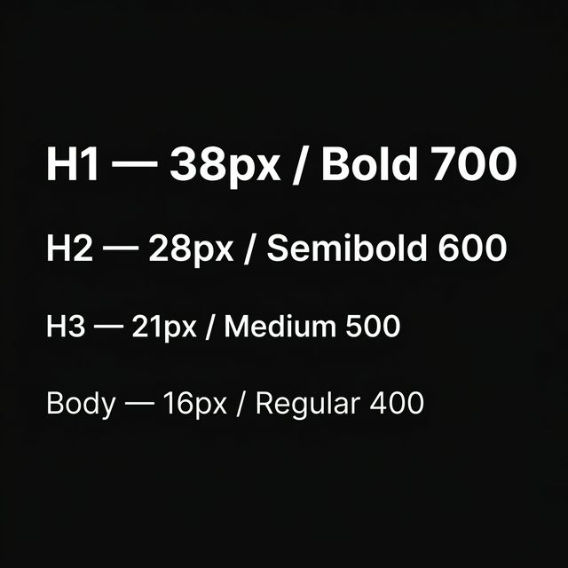
2. Typography That Commands Attention
Typography is arguably the single most important design decision you'll make. It's the first thing users actually read, and it subconsciously communicates whether your brand is trustworthy.
The formula:
- Heading font: Use a modern geometric sans-serif like Inter, Satoshi, or General Sans. These read as clean, authoritative, and premium.
- Body font: Keep it readable at
16–18pxline height with1.6–1.8ratio. - Type scale: Use a consistent modular scale. A
1.333ratio (Perfect Fourth) works beautifully for most SaaS sites. This means if your body text is16px, your H3 is ~21px, H2 is ~28px, and H1 is ~38px. - Font weight contrast: Pair a
700–800weight heading with400body text. This contrast creates instant visual hierarchy.
Pro tip: Limiting yourself to exactly one font family with 2–3 weight variations always looks better than mixing two random Google Fonts. Simplicity is the ultimate sophistication.
3. A Disciplined Color Palette
Color is where most DIY websites go horribly wrong. The temptation is to use bright, saturated primary colors everywhere. But premium design depends on restraint.
The 60-30-10 rule:
- 60% neutral base: Dark backgrounds (
#0a0a0a,#111) or clean whites - 30% secondary tone: Muted grays for text, borders, and cards
- 10% accent color: One punchy brand color used sparingly for CTAs, links, and highlights
Sites like Linear and Raycast nail this —they each use a dominant dark canvas with a single striking accent (purple for Linear, orange for Raycast). The result looks premium without any complex color theory.
Quick audit: If your website uses more than 3 distinct hues in your primary palette, you likely need to simplify. Fewer colors, applied consistently, always beats a rainbow.
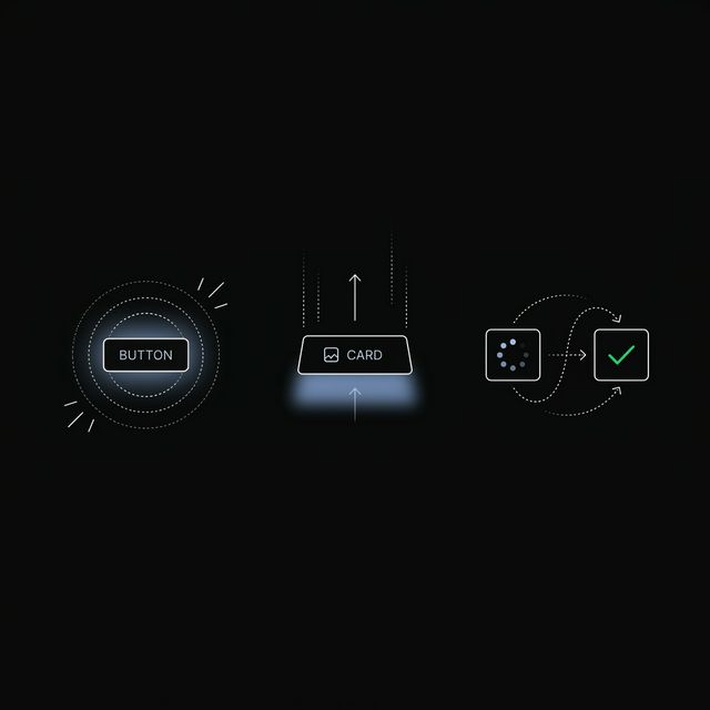
4. Micro-Animations and Motion Design
This is the principle that separates a "nice" website from a "wow, who built this?" experience. Subtle, purposeful motion design makes your interface feel alive, like a premium native app rather than a static HTML page.
What to animate:
- Hover states on buttons and cards (scale up
1.02–1.05) - Staggered entrance animations as sections scroll into view
- Smooth page transitions between routes
- Loading state transitions that feel intentional, not janky
What NOT to animate:
- Everything. Over-animation is worse than no animation. If every element bounces, nothing feels special.
- Layout-triggering properties (avoid animating
width,height,margin—stick totransformandopacityfor 60fps performance)
If you're in the React ecosystem, Framer Motion is the industry standard for physics-based animations. We've written a complete walkthrough on building animated hero sections for React that covers implementation from scratch. But the fastest path? Use pre-built, physics-tuned animated React components so you don't reinvent the wheel.
5. Visual Hierarchy and Layout Grid
A premium website doesn't feel cluttered because it has strong visual hierarchy. Every section makes it obvious what the user should look at first, second, and third.
The hierarchy stack:
- Primary: The headline or hero image (largest, boldest, most contrast)
- Secondary: Supporting text and key metrics
- Tertiary: Navigation, footer, fine print
Grid discipline: Stick to a consistent 12-column grid and align elements to it religiously. According to Interaction Design Foundation research, grid-aligned layouts improve user comprehension because our eyes naturally follow predictable structure.
Practical quick win: If your landing page hero section has more than 3 distinct elements fighting for attention, cut it down. One headline, one subline, one CTA. That's it. Check our guide on SaaS landing page best practices for a complete structural breakdown.
6. Consistent, High-Quality UI Components
Here's something that separates a $500 freelance site from a $50,000 agency build: component consistency. Every button, card, input field, dropdown, and navigation element should follow the same border radius, shadow depth, padding, and color scheme.
When your buttons, cards, navbars, and dropdowns all speak the same visual language, your website screams "this was built by professionals." When they don't match? Visitors notice, even if they can't articulate why it feels off.
The shortcut: Instead of building and maintaining a custom design system from scratch (which takes weeks), use a production-ready component library. ogBlocks provides over 50 premium, Framer Motion-powered React components—copy-paste ready—that guarantee consistency across your entire website. Buttons, testimonials, feature sections, animated carousels, pricing cards—all designed to work together seamlessly.
7. Photography, Imagery, and Social Proof
The final piece of the premium puzzle is visual content quality. Nothing tanks a professional layout faster than a blurry stock photo or a pixelated logo.
Rules for premium imagery:
- Use real product screenshots (not mockups from 2019)
- If using illustrations, stick to one consistent style
- Compress images to WebP format for fast loading (target under
200KBper hero image) - Customer logos should be monochromatic and consistent in size—see our guide on building trust with social proof
Social proof placement. According to Nielsen Norman Group, displaying social proof (logos, testimonials, case studies) immediately after the hero section increases scroll depth by 34%. It's not optional. It's a conversion multiplier.
Putting It All Together: A Quick Before/After Checklist
Use this checklist to audit any webpage. If you can check all 7 boxes, your site will feel dramatically better:
| # | Principle | Quick Test |
|---|---|---|
| 1 | Whitespace | Does every section have at least 80px padding? |
| 2 | Typography | Are you using a consistent type scale with 1 font family? |
| 3 | Color | Are you using ≤3 core colors with the 60-30-10 rule? |
| 4 | Motion | Do buttons and cards have subtle hover/tap animations? |
| 5 | Hierarchy | Can you identify what's #1, #2, #3 on each section? |
| 6 | Components | Do all buttons/cards/inputs share the same border-radius and padding? |
| 7 | Imagery | Are all images crisp, compressed, and consistently styled? |
Frequently Asked Questions
How can I make my website look more premium on a small budget? Focus on whitespace, typography, and color restraint first—these three principles cost nothing but have the biggest visual impact. Then use a pre-built, premium component library like ogBlocks to add polished animations and consistent UI elements without hiring a designer. You can realistically transform a basic site into a professional-looking one in a single weekend.
What is the single most important factor in making a website look professional? Typography. If your type scale is inconsistent, your font weights are random, or you're using default browser fonts, everything else falls apart. Choose one modern sans-serif font, define a clear heading hierarchy, and use it consistently across every page. This single change has more impact than any color scheme or animation.
Does adding animations slow down my website? Not if done correctly. Modern animation libraries like Framer Motion only animate GPU-accelerated CSS properties (transform and opacity), which run at a smooth 60 frames per second without impacting your Core Web Vitals scores. Avoid animating layout properties like width or height. For implementation details, read our Framer Motion and Next.js guide.
How do premium SaaS companies like Stripe and Linear achieve their polished look? They all follow the same core principles: generous whitespace, strict typography hierarchies, limited color palettes, and subtle micro-animations. They also maintain rigorous component design systems where every element (buttons, inputs, cards) uses identical border radii, shadows, and spacing. You can replicate this exact approach using ogBlocks without building a custom design system from scratch.
Is it worth investing in a UI component library instead of building custom components? Absolutely. Building and maintaining a custom design system takes roughly 200–400 engineering hours. A premium component library like ogBlocks gives you the same consistent, animated, production-ready components for a fraction of the time and cost. For indie hackers and small agencies, it's the highest-leverage investment you can make.
Written by Karan
Karan is a React engineer and the founder of ogBlocks, building high-performance UIs for SaaS.