
7 Micro Animations in Website Design That Turn Visitors Into Buyers
You know that feeling when you visit a SaaS website and it just feels alive? You hover over a button and it subtly expands with a smooth shadow. You click a pricing tier and a tiny checkmark bounces into place. These are not just flashy gimmicks. They are micro animations in website design. Top-tier web agencies and indie hackers use them to turn casual visitors into paying customers.
If you are a SaaS founder, an indie hacker, or a web agency owner, you already know how hard it is to capture user attention. The internet is crowded and standard static pages no longer impress anyone. Users want a premium and polished feel. If your website feels rigid, they will subconsciously associate that rigidity with your actual product. Adding micro interactions and micro animations can transform a boring user interface into an engaging experience that actually converts.
Let's break down exactly what micro animations are, the psychology of why they work so well, and why your SaaS needs them right now. We will also look at how you can implement them to increase your conversions without spending weeks coding complex interactions from scratch.
Key Takeaways:
- Boosts Conversions: Micro animations provide instant visual feedback, reducing user uncertainty and friction during onboarding or checkout.
- Enhances Perception: Smooth interactions make your SaaS feel more expensive and trustworthy to potential customers.
- Guides Attention: Strategic motion draws the user's eye directly to your primary call-to-actions, naturally increasing click-through rates.
- Keep It Fast: For the best performance, keep UI animations between 200ms and 400ms using hardware-accelerated CSS or optimized libraries like Framer Motion.
Table of Contents
- What Are Micro Animations in Website Design?
- The Psychology Behind Why Micro Interactions Work
- Why SaaS Founders and Indie Hackers Need Micro Interactions
- 7 Examples of High-Converting Micro Animations
- How to Implement Micro Animations (Without Slowing Down Your Site)
- The Ultimate Solution: Stop Building From Scratch
- Frequently Asked Questions (FAQ)
What Are Micro Animations in Website Design?
Micro animations in website design are small, subtle, and highly functional animations that provide immediate visual feedback to users. They guide them through tasks and enhance the overall user experience. Large animations like a massive hero section background video or a complicated 3D WebGL render are meant to wow the user. Micro animations, on the other hand, focus entirely on usability, intuition, and communication.
Think of them as the digital equivalent of a physical button clicking when you press it on a keyboard, or the satisfying snap of a magnetic case closing. When a user interacts with a digital interface, they need to know their action was registered by the system. Did the form submit properly? Is the page currently loading data, or did it freeze? Did the item actually get added to the cart?
Micro interactions solve these problems. These tiny design details bridge the gap between human intent and computer reaction. When you build an interactive website, you are communicating with your users non-verbally. You are telling them, "Yes, I saw that you clicked this, and here is what is happening next." It transforms a static page into an interactive dialogue.
The Psychology Behind Why Micro Interactions Work
To understand the power of micro animations, we have to look at how the human brain processes digital interfaces. As humans, we have evolved to notice movement. In the physical world, movement usually means something important is happening. It naturally demands our attention.
When you apply this to web design, subtle motion acts as a guide. It reduces cognitive load by making the interface feel intuitive. If a user tries to submit a form with an empty required field, a rigid red text box saying "Error" requires them to read and process the information. But if the input field does a quick horizontal "shake" animation, the user instantly understands the error without reading a single word. It mimics a human shaking their head "no."
Micro interactions also provide positive reinforcement. When a user completes a task, like signing up for your SaaS or finishing an onboarding sequence, a small burst of confetti or a checkmark drawing itself provides a tiny hit of dopamine. This positive reinforcement encourages them to continue using your product. It makes the digital experience feel less like a chore and more like a game.
Why SaaS Founders and Indie Hackers Need Micro Interactions
As a founder, developer, or agency owner, your primary goal is growth and revenue. You might wonder if you really have the time to worry about tiny animations when you have massive backend features to build and bugs to fix. The short answer is yes. Here is exactly why micro interactions matter for your bottom line.
1. Provides Instant Feedback and Reduces Uncertainty
When a user clicks your "Sign Up" button and nothing happens for three seconds while your server processes the request, they panic. They might click the button three more times, potentially causing duplicate accounts or billing errors. They might even assume your site is broken and leave entirely. A simple loading spinner, a button state change, or a subtle color shift provides instant feedback. This alone can drastically reduce friction during onboarding and prevent users from abandoning the checkout or signup process.
2. Increases Click-Through Rates (CTR)
An interactive element begs to be clicked. It is human nature to play with things that respond to our touch. When a user hovers over a pricing card and it slightly elevates with a soft drop shadow, their brain registers it as a physical, clickable object. This tactile feel naturally draws the cursor in and can increase the click-through rate on your website, guiding users from your landing page directly into your checkout form.
3. Makes Your SaaS Look Expensive and Premium
Trust is the currency of SaaS. If your website looks like it was built with a generic template in 2012, nobody is going to trust you with their credit card information. Polished micro animations signal to the user that you care about the details. If your marketing site is well-crafted and smooth, they will assume your actual product is just as good. It is the easiest and most effective way to make your website look premium without having to redesign your entire brand identity.
4. Guides User Attention
You can use subtle motion to draw the user's eye exactly where you want it to go. A gentle bounce on a "Start Free Trial" button, or a slight pulse on a notification bell, can act as a visual anchor. It pulls the user's attention away from secondary elements and guides them directly toward your primary call to action.
7 Examples of High-Converting Micro Animations
If you want to see world-class examples, directories like Awwwards showcase incredible microinteractions from top design agencies. But for SaaS founders and indie hackers, you don't need overly complex WebGL animations that take months to build. You just need practical and reliable animations that drive results.
Here are seven micro animations in website design that you can implement today:
1. Hover States on Buttons and Cards
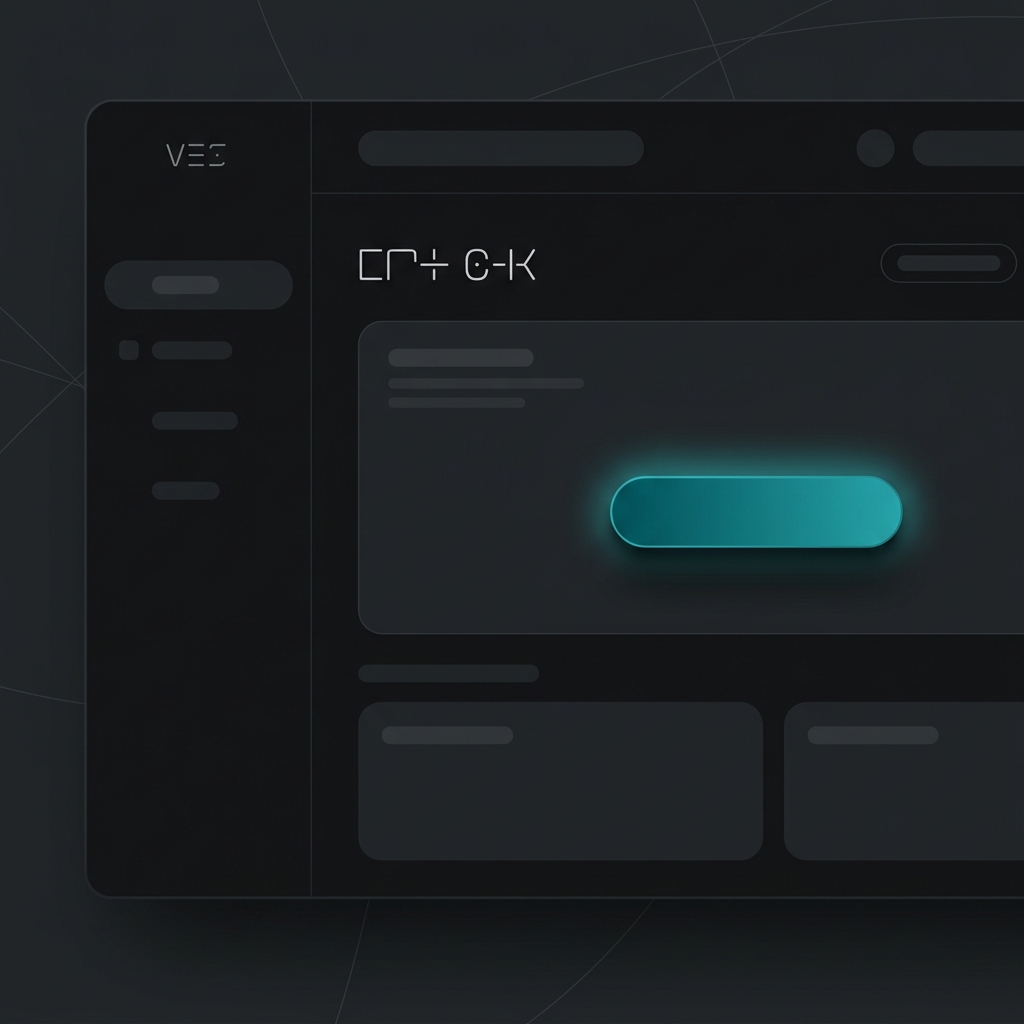
This is the most fundamental micro interaction you can add. When a cursor moves over an element, the element should react. Whether it is a subtle background color shift, a slight scale-up, or a sleek shadow expansion, hover states confirm interactivity and invite the click.
2. Form Validation Animations
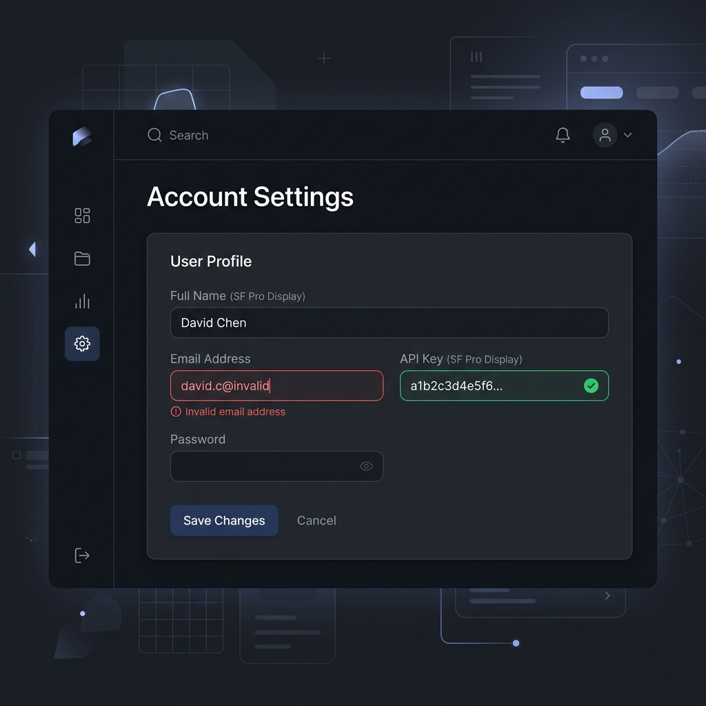
Filling out forms is notoriously boring and often frustrating for users. When a user makes a mistake, a gentle shake animation on the input field instantly communicates the error visually. On the flip side, a satisfying green checkmark animation when a field is filled out correctly provides a hit of dopamine. This encourages them to finish the form and convert.
3. Loading Skeletons
Instead of showing a blank white page or a spinning wheel while data fetches from your database, use skeleton screens. These animated shimmering placeholders mimic the layout of the incoming content. This makes the wait feel shorter and keeps the user engaged by showing them exactly what is about to appear.
4. Success Checkmarks and Action Completed States
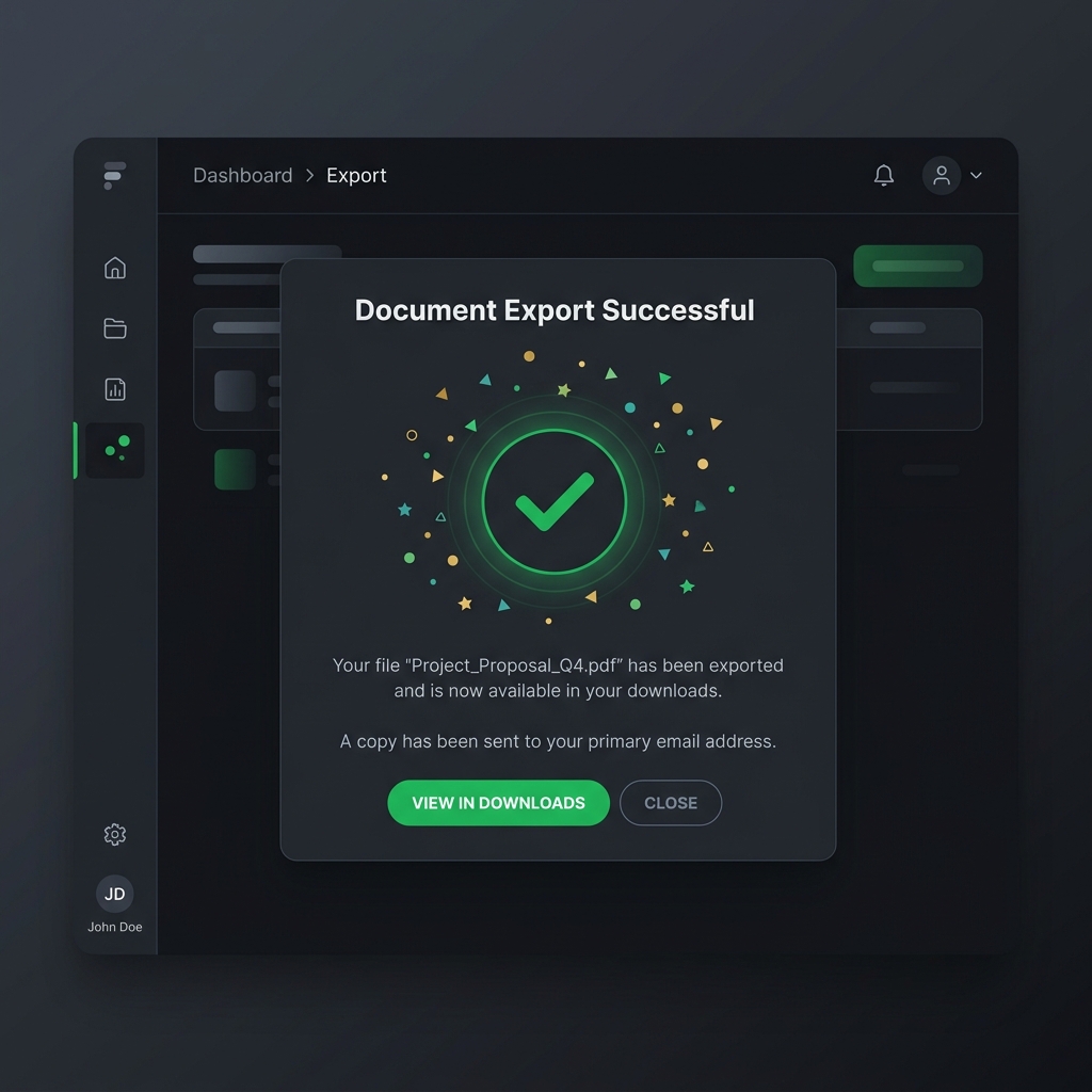
When a user pays for your SaaS subscription, submits a contact form, or completes a critical onboarding step, reward them. A dynamic animated success checkmark or a tiny burst of confetti makes the experience memorable. Webflow highlights how these microinteractions can boost long-term user engagement by creating positive reinforcement loops.
5. Animated Navigation Menus
Your navigation menu is the structural roadmap of your website. A smooth slide-down animation for dropdown menus, or a clean hamburger menu transformation into an X on mobile devices, makes navigation feel effortless and responsive.
6. Scroll Progress Indicators
For long-form content, a subtle scroll progress bar fixed to the top of the screen helps users understand exactly where they are. It provides context and encourages them to keep scrolling to reach the end.
7. Expandable Accordions and FAQ Sections
Instead of having answers instantly snap open and jump the page layout around, use a smooth easing transition to slide the content open. This prevents the user from losing their place on the page and feels much more elegant.
How to Implement Micro Animations (Without Slowing Down Your Site)
The biggest fear developers and founders have when adding animations is performance degradation. You definitely do not want your site to feel sluggish, drop frames, or tank your Google Lighthouse scores. Here are some best practices for implementing micro animations without issues:
- Keep it fast: Micro animations should be quick. The sweet spot for UI interactions is usually between 200ms and 400ms. Anything longer feels sluggish and wastes the user's time. Anything shorter feels abrupt.
- Use hardware-accelerated CSS: For simple hover states and transitions, CSS transform and opacity are your best friends. They are hardware-accelerated by the GPU and are very performant. Avoid animating properties like width, height, or margin, as these trigger expensive layout recalculations.
- Leverage Framer Motion for React: If you are building a modern React or Next.js based SaaS, Framer Motion is the standard for complex physics-based animations. It makes creating fluid spring-based UI states incredibly easy.
- Respect user preferences: Always utilize the prefers-reduced-motion media query. Some users suffer from vestibular disorders and motion sickness. Your site must degrade gracefully and remove excessive motion for these users.
- Don't overdo it: Too much motion causes cognitive overload and visual noise. Only animate elements that require user attention or interaction. If everything is moving, nothing is important.
If you want to integrate high-quality motion into your React app effortlessly, you should explore using pre-built React animated components.
The Ultimate Solution: Stop Building From Scratch
As an indie hacker, SaaS founder, or agency owner, your time is your most valuable asset. Spending 15 hours tweaking cubic-bezier curves for a button hover state, or trying to build the perfect animated dropdown menu from scratch, is a waste of your valuable resources. You should be talking to customers, marketing your product, and building core features instead of reinventing the UI wheel.
This is exactly why you need ogBlocks.
ogBlocks is a copy-and-paste React component library designed specifically for SaaS founders, indie hackers, and web agencies. We have already done the hard work of designing, coding, and testing the best micro animations in website design.
With ogBlocks, you get:
- Production-Ready Code: Copy and paste fully animated React components directly into your Next.js or Vite app in seconds.
- Premium Aesthetics: Instantly give your SaaS that expensive look with zero design skills required.
- Conversion-Optimized: Every component is built with UX best practices to reduce bounce rates and maximize your sales and signups.
- Fully Customizable: Built strictly with Tailwind CSS and Framer Motion, making it effortless to tweak and match your brand's exact look and feel.
Stop losing potential customers to boring static websites. Stop wasting days coding basic UI components from scratch when you could be shipping features.
Get lifetime access to ogBlocks today and ship your next project 10x faster with world-class design.
Frequently Asked Questions (FAQ)
What are micro animations in website design?
Micro animations are small, functional visual effects used to improve user interface feedback and usability. They include interactions like hover states, button clicks, loading indicators, and form validations. They are designed to guide users through a digital experience without causing distraction.
Do micro interactions affect website performance?
When implemented correctly using hardware-accelerated CSS properties like transform and opacity or optimized libraries like Framer Motion, micro interactions do not negatively impact site performance. In fact, they improve perceived performance by keeping users visually engaged during loading times.
Why are micro animations important for SaaS conversions?
Micro animations provide immediate visual feedback, reduce user uncertainty, and make a website feel premium. By creating a polished and tactile digital experience, SaaS companies can lower bounce rates, increase click-through rates, and drive more signups and revenue.
Written by Karan
Karan is a React engineer and the founder of ogBlocks, building high-performance UIs for SaaS.