
The CTA section design mistake That's Killing Your Conversions
If you are a SaaS founder, an indie hacker, or running a web agency, you already know that driving traffic to your site is only half the battle. The real challenge is converting that hard-earned traffic into paying customers. This is where mastering CTA section design becomes absolutely crucial for your business's bottom line.
A well-crafted bottom call-to-action area acts as the final handshake between you and your prospective user. They have scrolled through your beautiful hero sections, read your detailed features, and engaged with your glowing social proof. Now, they are at the very bottom of the page, actively deciding whether to take the leap or bounce back to Google. Your CTA design is the ultimate deciding factor in that split-second decision.
Table of Contents
- Why Your Bottom CTA Matters More Than You Think
- The Perfect Anatomy of a CTA Section
- Deep Psychology: Why Users Click
- Common Mistakes Killing Your Conversions
- Inspiration and Real-World Examples
- Why You Should Use ogBlocks for Your CTAs
- Frequently Asked Questions
- Conclusion
Why Your Bottom CTA Matters More Than You Think
Many developers and founders spend hours agonizing over perfecting their hero section best practices and tweaking their SaaS landing page features, only to slap a generic, uninspired "Sign Up Now" button at the very bottom of the page. This is a massive, costly missed opportunity.
When a user reaches the bottom of your landing page, they have demonstrated incredibly high intent. They have consumed your content, scrolled past your competitors' distractions, and are actively looking for direction. If your CTA section design is weak, visually confusing, or lacks vital reassurance, that high-intent visitor will leave. Your acquisition costs go completely to waste, and your bounce rate spikes.
Great CTA design provides absolute clarity, a sense of urgency, and immense trust simultaneously. It is not just about choosing a brightly colored button and calling it a day; it is about creating an environment where saying "yes" feels like the most logical, natural, and safe next step for the user. By optimizing this specific, targeted area, you can dramatically increase your overall conversion rates without needing to spend another dime driving additional traffic to your site. It is pure ROI.
The Perfect Anatomy of a CTA Section
When we deeply analyze top-performing SaaS websites and high-conversion marketing landing pages, a clear, undeniable pattern emerges. The most effective bottom sections follow a very specific, repeatable formula. Forget throwing elements on a page and hoping they stick. Here is the exact, optimal way your bottom CTA section should be structured for maximum impact.
1. A Benefit-Driven Title
Your title is the hook. It is the very first thing the user reads when they hit the bottom of the page. It should never be a generic command like "Start Your Free Trial Today." Instead, it must violently remind the user of the core benefit they are about to receive. What is the ultimate, life-changing transformation your product provides?
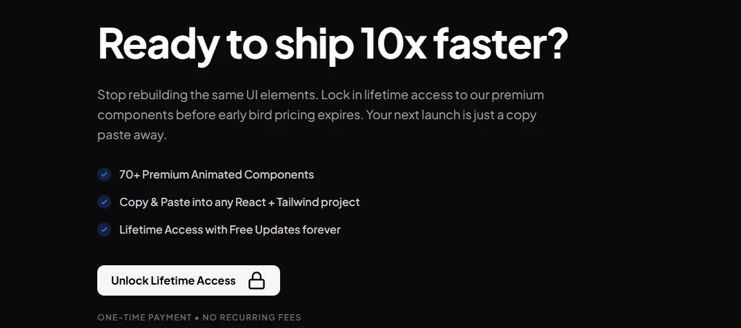
For example, if you are selling a developer tool to speed up coding, a strong title would be, "Ready to ship 10x faster?" It focuses entirely on the desired outcome. The title needs to be visually prominent, using a large, legible font (typically structured with an H2 tag for solid SEO structuring) that contrasts beautifully with the background. It should immediately grab attention and reignite the initial desire that brought the user to your site in the first place.
2. A Supporting Subtitle
If the compelling title is the hook, the subtitle is the logical explainer. It should be a brief sentence or two directly underneath the title that adds critical context, removes immediate friction, or adds a subtle layer of urgency.
A fantastic subtitle smoothly transitions the user from the emotional pull of the title to the logical, necessary action required. Continuing our developer tool example, the subtitle might read: "Stop rebuilding the same UI elements. Lock in lifetime access to our premium components before early bird pricing expires. Your next launch is just a copy-paste away." This provides immense value proposition and overcomes the objection of time commitment while adding urgency. In your CTA section design, ensure the subtitle is visually distinct from the title—usually smaller, perhaps slightly lighter in color or typography weight, but still incredibly easy to read across all devices.
3. Clear, Value-Packed Bullet Points
This is where the vast majority of designers and developers go wrong: they leave the precious space between the subtitle and the button completely empty. Including a short, punchy list of bullet points in your CTA design is a proven conversion game-changer.
Why is this so effective? Because users skim. They are busy. They might have skipped over your meticulously detailed features section entirely. Bullet points right before the final CTA serve as a rapid-fire, impossible-to-ignore recap of your most compelling value propositions.
You should aim for exactly 3 to 4 concise bullet points. Use custom checkmarks or beautifully designed icons to make them visually appealing. They should aggressively reinforce exactly what the user is getting the second they click that button. For example:
- 70+ Premium Animated Components
- Copy & Paste into any React + Tailwind project
- Lifetime Access with Free Updates forever
- Priority Discord Support from the creators
4. The Main CTA Button
Now we arrive at the star of the show: the CTA itself. The button needs to be absolutely impossible to miss. It should use a striking color that contrasts sharply with the background and the rest of the section, drawing the human eye naturally and irresistibly.
The copy on the button is just as critical as its visual design. Avoid lazy words that imply work, like "Submit," "Register," or "Buy." Instead, use high-energy, action-oriented, value-driven words. "Unlock Lifetime Access," "Start Building Faster," or "Get My Free Dashboard" perform significantly better in every A/B test.
Furthermore, you must consider adding premium micro-interactions to your button using a robust library like Framer Motion. A subtle, satisfying hover effect, a slight scale-up on interaction, or a beautiful glowing border can make the button feel alive, premium, and practically beg to be clicked. You can read more about mastering this in our detailed guide on how to build a react animated button.
5. FUD Killers (Fear, Uncertainty, Doubt) Below It
This is the absolute secret weapon of elite CTA section design. Right below your main CTA, you need to strategically place FUD killers. When a user hovers over your button, their brain immediately starts firing off objections and anxieties: Will they charge my card right now? Is it going to be hard to cancel? What if I end up hating it? Is this a recurring subscription?
FUD killers are tiny, highly calculated snippets of text that proactively answer those exact objections right at the very point of maximum friction. Common, highly effective FUD killers include:
- "No credit card required to start"
- "14-day unconditional money-back guarantee"
- "One-time payment • No recurring fees"
- "Cancel anytime in one click"
By placing these directly under the button (often neatly formatted in a smaller, slightly muted text color so it doesn't visually compete with or distract from the button itself), you provide the ultimate, final reassurance the user desperately needs to convert.
6. Strategic Social Proof
While you likely have a dedicated testimonials section elsewhere on your landing page, incorporating a subtle element of social proof within the CTA section itself is highly effective. It acts as a final nudge, showing that others have successfully taken the leap.
You can include small avatars of happy customers, a concise 5-star rating summary (e.g., "⭐⭐⭐⭐⭐ Trusted by 5,000+ developers"), or a very short, impactful quote placed near the button. This reminds the user that they are joining a thriving community or utilizing a proven solution, significantly reducing their perceived risk.
Deep Psychology: Why Users Click
To truly master this discipline, you need to understand the deep psychological principles behind why users actually click buttons on a screen. Effective CTA design leverages several powerful cognitive biases:
The Isolation Effect (Von Restorff Effect): This foundational principle states that an item that stands out significantly from its surroundings is far more likely to be remembered and interacted with. By making your button highly contrasting in color and size, you ensure it is the undisputed focal point of the section.
Loss Aversion: Human beings strongly prefer avoiding losses over acquiring equivalent gains. Framing your subtitle or bullet copy around what they actively miss out on by not clicking (e.g., "Stop wasting 20 hours a week on boilerplate code") can be highly persuasive and push them over the edge.
Social Proof: We inherently look to the behavior of others to determine correct behavior for ourselves, especially in situations of uncertainty. While you might have a massive dedicated testimonials section above, sneaking a tiny bit of concentrated social proof near your CTA (e.g., "Join 5,000+ happy developers shipping faster") validates their purchasing decision right before they pull out their credit card.
Common Mistakes Killing Your Conversions
Even seasoned agency owners and experienced frontend developers sometimes make critical, conversion-killing errors in their bottom sections. Here are a few major pitfalls to aggressively watch out for:
Too Many Conflicting Choices: The bottom of your page should have one, singular, primary goal. If you place a "Sign Up," "Read the API Docs," and "Contact Enterprise Sales" button all next to each other with equal visual weight, you cause immediate decision paralysis. Stick to one primary action.
Weak, Uninspired Copy: Generic text like "Ready to start?" followed by a gray "Click Here" button inspires exactly zero confidence, excitement, or desire. Your copy must sell the outcome.
Poor Mobile Optimization: Over 50% (often much more) of your traffic is likely viewing your site on a mobile device. If your CTA section design breaks on small screens, if the text overlaps, or if the button is too small to tap comfortably with a thumb, you are bleeding conversions by the second. Your design must be flawlessly responsive.
Lack of Visual Hierarchy: If everything is bold, large, and colorful, nothing stands out. Your title should be the largest text, followed by the high-contrast button, then the subtitle and bullets, and finally the subtle FUD killers. Hierarchy guides the eye logically.
Inspiration and Real-World Examples
When looking for top-tier inspiration for your own SaaS projects, there are excellent resources dedicated to meticulously curating the absolute best designs on the modern web.
For instance, checking out dedicated galleries like Unsection CTA designs or specialized repositories like CTA Gallery can provide a massive wealth of visual ideas. They showcase exactly how different top-tier SaaS companies and unicorns utilize negative spacing, modern typography, and vibrant color to draw the user in. You will notice that almost all the high-performing, million-dollar examples featured on these sites closely follow the exact anatomy we outlined above: incredibly strong titles, supporting text, clear buttons, and reassuring FUD killers.
Why You Should Use ogBlocks for Your CTAs
You are a busy developer, a solo founder, or an agency owner juggling multiple clients. Your time is incredibly valuable. Spending 10 hours tweaking CSS grids, adjusting padding for mobile responsiveness, and building complex Framer Motion micro-animations for a single bottom section is a terrible, inefficient use of your limited resources.
Instead of stubbornly building everything from scratch, you should be heavily utilizing ogBlocks.
ogBlocks is a truly premium React and Tailwind CSS component library meticulously designed specifically for modern, high-growth SaaS applications. Our extensive library includes a wide array of stunning, conversion-optimized react animated components, including beautifully crafted CTA sections that strictly follow every single best practice mentioned in this comprehensive article.
When you invest in ogBlocks, you get:
- Instant Implementation: Simply copy and paste beautiful, fully responsive sections directly into your Next.js or React project in seconds.
- Conversion Optimized by Default: Our designs aren't just pretty; they are built mathematically on the proven principles of high-converting landing pages, featuring the perfect, battle-tested layout of titles, bullets, buttons, and FUD killers.
- Premium, Agency-Grade Aesthetics: Make your website look like it was designed by a $50k top-tier design agency with our incredibly smooth animations, glassmorphism effects, and polished UI. Read more on how to make your website look premium.
- Insane Lifetime Value: Stop reinventing the wheel and fighting with CSS for every new project. Buy once, get access forever, and use our premium components to launch your stunning SaaS products 10x faster for the rest of your career.
If you are serious about drastically increasing your conversion rates, looking wildly professional, and saving literally hundreds of frustrating development hours, you absolutely need the right tools in your arsenal.
Stop rebuilding the same UI elements. Your next massive launch is just a copy-paste away.
Unlock Lifetime Access to ogBlocks Today One-time payment • No recurring fees • Free updates forever • Use on unlimited commercial projects
Frequently Asked Questions
What makes a good bottom section for a landing page?
A highly effective good bottom section acts as a strong, compelling final pitch. It absolutely must contain a benefit-driven title, a clarifying subtitle, 3-4 bullet points summarizing the core value, a highly visible contrasting button, and FUD (Fear, Uncertainty, Doubt) killers directly beneath the button to remove any final, lingering hesitations a user might have.
Should I put multiple buttons in my bottom section?
Generally, absolutely no. You should focus entirely on one primary conversion goal to avoid decision paralysis. If you absolutely must have a secondary action (like "Contact Sales" for enterprise clients), it should be visually deprioritized heavily, perhaps styled as a subtle ghost button or a simple, unadorned text link.
How important are FUD killers in design?
They are critically important and often the difference between a bounce and a sale. FUD killers (like "No credit card required" or "Cancel anytime") directly answer the subconscious objections and anxieties a user has right before clicking the buy button. They significantly reduce friction and massively increase the likelihood of conversion.
Can I just copy a design I like from another site?
While you can certainly take inspiration, it's far better to understand the why behind a design. Simply copying HTML/CSS can lead to broken responsiveness or clashing styles. Alternatively, using a dedicated premium component library like ogBlocks ensures you get a beautifully designed, conversion-optimized section that you can drop into your modern React codebase legally, instantly, and with zero styling conflicts.
Conclusion
Your CTA section design is the absolute finish line of your landing page. Do not let your hard-won users trip right before they cross it. By strictly implementing the perfect anatomy—a strong benefit title, supporting subtitle, value-packed bullets, a prominent high-contrast CTA, and reassuring FUD killers—you purposefully build a persuasive, totally frictionless path to conversion.
As a SaaS founder, indie hacker, or agency owner, your primary goal should always be to launch faster, look better, and convert higher. Stop wasting your precious time manually building these intricate sections from scratch. Elevate your design standard and skyrocket your conversions by grabbing the ogBlocks component library today. Your conversion rates (and your sanity) will thank you immensely.
Written by Karan
Karan is a React engineer and the founder of ogBlocks, building high-performance UIs for SaaS.