
The Unspoken Rules on How to Design the Features Section
Key Takeaways
- Start with Benefits, Not Specs: The most critical aspect when learning how to design the features section is to translate technical specifications into tangible, emotional user benefits.
- Visual Hierarchy is Essential: Use negative space, structured typography, and clear focal points to guide the user's eye naturally through the layout.
- Implement Bento Grids: Modern feature page design often relies on asymmetric grid layouts (like Bento grids) to organize complex information in a digestible, visually appealing format.
- Micro-Interactions Build Trust: Adding subtle, physics-based animations to your components makes your software feel premium, deeply considered, and reliable.
Table of Contents
- The Anatomy of a Perfect Feature Showcase
- What Makes a High-Converting Feature Section?
- Step-by-Step: How to Design the Features Section
- Feature Page Design Best Practices
- The Role of Animation and Micro-interactions
- Stop Coding from Scratch (The Smart Way to Build)
- Complete Summary
- Frequently Asked Questions
Hey SaaS founders and agency owners! If you're struggling to turn your website visitors into paying customers, you might be overlooking one of the most critical parts of your landing page. You've hooked them with an incredible hero section, but when they scroll down to see what your product actually does, they bounce.
The secret to a high-converting website lies heavily in how to design the features section. It is not just about slapping a few icons next to paragraphs of text. A great feature section must instantly communicate the value of your product, seamlessly guide the user's eye through a logical narrative, and definitively answer the question: "How does this make my life easier?" By employing modern layout techniques like bento grids, focusing entirely on user benefits rather than technical jargon, and adding premium micro-interactions, you can dramatically increase your conversion rates and lower your customer acquisition costs.
In this comprehensive, deep-dive guide, we are going to explore exactly how to architect, design, and implement a feature section that doesn't just look pretty, but acts as a relentless, 24/7 salesperson for your software product. We'll cover everything from copywriting psychology to modern CSS layout strategies.
The Anatomy of a Perfect Feature Showcase
When visitors land on your website, they are implicitly asking you to solve a problem. They are skeptical, short on time, and easily distracted. If your website resembles a dense technical manual rather than a sleek, modern digital storefront, you will lose them.
The feature section is the bridge between the grand promise made in your hero section and the final pricing checkout page. It is where the rubber meets the road. It’s where you prove that your software actually possesses the capabilities to eliminate their specific operational bottlenecks.
A perfectly executed section requires a delicate balance of three core elements:
- Persuasive Copywriting: Words that resonate with the reader's pain points.
- Intuitive Layouts: Visual structures that make scanning effortless.
- High-Fidelity Visuals: Screenshots, animations, or interactive components that prove the software exists and looks incredible.
Let's break down exactly how you can master these three pillars to create a robust, high-converting digital experience.
What Makes a High-Converting Feature Section?
Before we dive into the technical execution, we need to understand the psychology behind why certain designs convert at 5% while others struggle to hit 0.5%. The fundamental difference always comes down to empathy and clarity.
Benefit-Driven Copywriting Over Technical Specs
The most common trap technical founders fall into is assuming their customers care deeply about the underlying technology. They don't. Your customers care about saving time, making money, and reducing their daily stress.
When you sit down and figure out how to design the features section, your primary goal is translation. You must translate a technical reality into an emotional benefit.
- Technical Spec: "Our API processes requests in under 50ms using edge computing."
- Benefit Translation: "Give your users a lightning-fast experience that never lags, no matter where they are in the world."
Every single headline in your feature showcase should follow this rule. The sub-text can briefly mention the technical 'how', but the headline must emphatically declare the 'why'.
Logical Information Architecture
When users scroll, they don't read; they scan. They look for bold headings, bullet points, and captivating images. If they see a wall of text, their cognitive load spikes, and they immediately abandon the page.
To combat this, you must structure your information hierarchically. Start with your most powerful, universally applicable feature first. This is your "hero feature." Follow this with secondary features that support the main value proposition. Group related capabilities together so the user can easily build a mental model of your software's ecosystem.
Step-by-Step: How to Design the Features Section
Designing this crucial part of your site doesn't have to be a guessing game. By following a proven, systematic approach, you can engineer an experience that naturally drives users toward the checkout button. Here is the step-by-step blueprint.
Step 1: Start with a Strong Section Hook
Don't just transition abruptly from your social proof logos into a grid of icons. You need a section header that re-engages the reader. Use a bold H2 that acts as a mini value proposition.
Instead of a boring heading like "Features," use something dynamic like "Everything You Need to Scale Your Agency, Out of the Box." This sets the context and explicitly tells the reader what to expect. Follow this up with a short, 2-sentence paragraph that summarizes the collective power of the tools you are about to showcase.
Step 2: Implement the Z-Pattern or Alternating Layouts
For a long time, the standard approach was just a 3-column grid of FontAwesome icons. In 2026, that simply won't cut it. For deep, complex software, the alternating Z-pattern layout is highly effective.
This involves placing a large, high-fidelity image or interactive component on the left, with text on the right. In the next row, you swap them: text on the left, image on the right. This zig-zag pattern naturally pulls the user's eye down the page, a concept validated by Baymard Institute UX research, keeping them engaged as they scroll. It allows you to dedicate significant screen real estate to showing off the beautiful UI of your actual product.
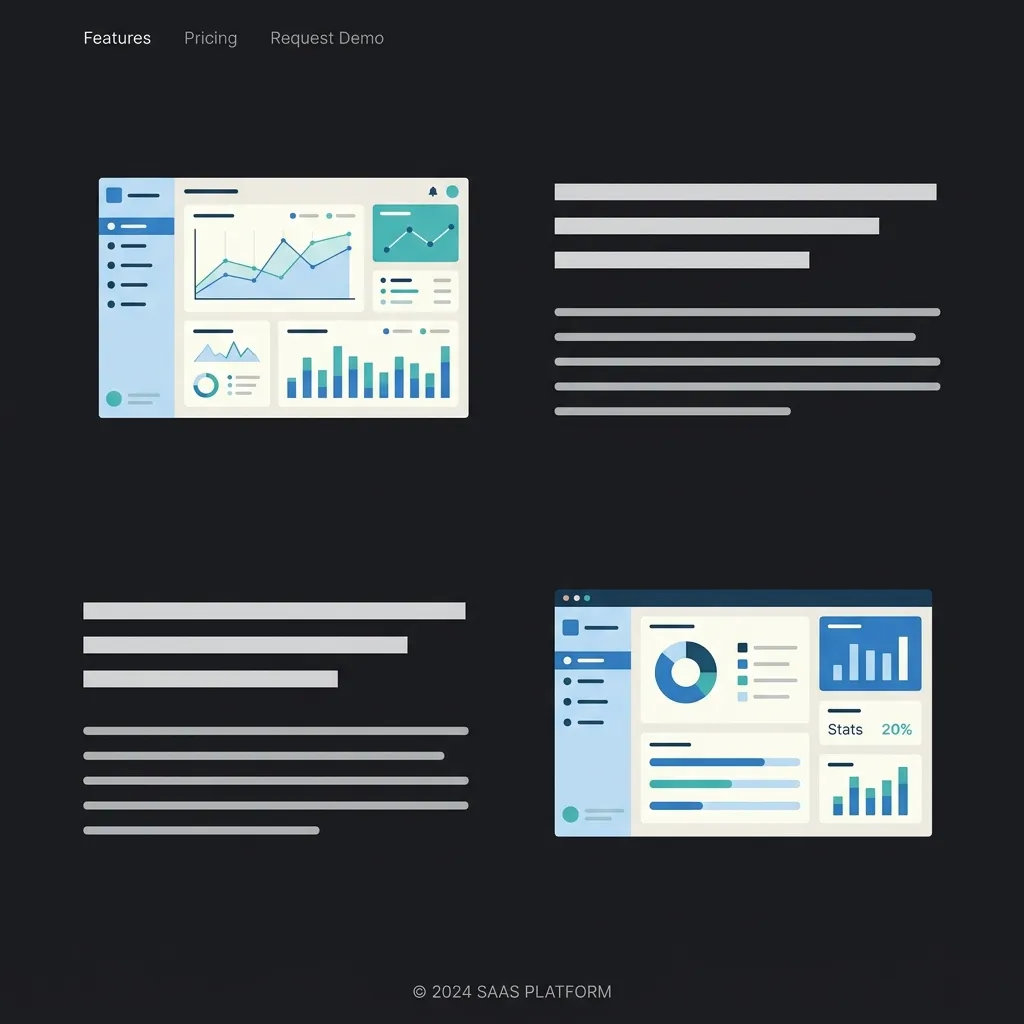
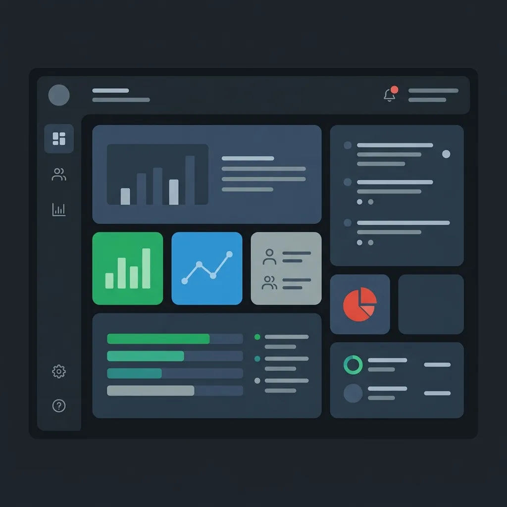
Step 3: Utilize Modern Bento Grids
If you have a lot of smaller, distinct capabilities to show off, the Bento Grid is the absolute pinnacle of modern UI design. Inspired by Japanese bento boxes, this layout uses asymmetrical, rounded-corner cards packed tightly together.
Bento grids allow you to display a high density of information without it feeling overwhelming. You can have a large card for your main feature, a tall vertical card for a specific use case, and smaller square cards for integrations or minor utilities. It creates a visually stunning mosaic that begs to be explored.
Step 4: Show, Don't Just Tell
The era of using abstract, generic vector illustrations is over. SaaS buyers are incredibly savvy; they want to see the actual software before they hand over their credit card.
Instead of an illustration of a rocket ship to signify "speed," use an actual screenshot of your dashboard's performance metrics. Even better, embed a lightweight, interactive code component that lets them play with the UI right there on the landing page. If your product is a drag-and-drop builder, let them drag and drop a simplified version of it. Tangible proof always wins over abstract promises.
Feature Page Design Best Practices
If you are building a dedicated page solely for your product's capabilities, the rules change slightly. A dedicated feature page design allows you to go much deeper into the weeds, but you still must maintain strict UX discipline.
Embrace Negative Space
White space (or negative space) is your best friend. It gives your content room to breathe. When elements are packed too closely together, they compete for the user's attention, creating visual anxiety. By generously spacing out your alternating rows or bento grid cards, you subtly communicate confidence. You are telling the user, "Our features are so strong, they can stand on their own without being crowded."
Integrate Micro-Testimonials
Social proof shouldn't be confined to a single section near the top of your site. It should be sprinkled contextually throughout the entire experience.
When you are highlighting your analytics dashboard, include a tiny, one-sentence quote from a customer specifically praising the analytics dashboard directly beneath it. This contextual social proof is incredibly powerful because it validates the specific claim you just made in real-time.
Ensure Mobile Perfection
It is absolutely vital to remember that over 50% of your initial traffic will likely come from mobile devices. An intricate, beautiful 4-column Bento grid on a 4K monitor will become a catastrophic, unreadable mess on an iPhone if not handled correctly.
Your feature page design must be fundamentally responsive. Complex grids should elegantly collapse into a single, scrollable column. Font sizes should scale appropriately, and touch targets (like interactive tabs or buttons) must be large enough to tap comfortably with a thumb.
For more insights on structuring your overall layout, you can check out our guide on SaaS landing page best practices.
The Role of Animation and Micro-interactions
In the highly competitive SaaS market, having functional software is the baseline. To truly stand out, your website needs to feel alive. This is where motion design and micro-interactions come into play.
When a user scrolls down to your feature showcase, elements shouldn't just abruptly appear. They should smoothly fade and slide into place, respecting the physics of the real world. When a user hovers over a specific feature card, it should subtly scale up, perhaps with a soft glow or a dynamically shifting gradient border.
These micro-interactions serve a dual purpose. Firstly, they provide immediate, satisfying visual feedback, making the website fun to interact with. Secondly, they subconsciously signal extreme quality. If a company cares enough to perfectly ease the transition of a hover state, the user naturally assumes the underlying software is engineered with the exact same meticulous care and attention to detail.
You can learn more about creating high-end experiences in our article on How to make your website look premium. Also, ensure your top-of-page experience matches this quality by reviewing Website hero section best practices.
Stop Coding from Scratch (The Smart Way to Build)
We've covered the extensive psychology, the layout strategies, the copywriting frameworks, and the animation requirements. By now, you might be thinking, "This sounds like it will take my engineering team three weeks to build from scratch."
And you would be absolutely right. Building a robust, animated, fully responsive, and accessible feature showcase from scratch using raw React, Framer Motion, and Tailwind CSS is a massive, time-consuming undertaking. It drains your runway and pulls your best engineers away from building your actual core product.
There is a much smarter, faster way to ship.
Introducing ogBlocks: Your Secret Weapon
You don't need to reinvent the wheel. ogBlocks is a premium, meticulously crafted React component library designed specifically for SaaS founders, indie hackers, and agency developers who refuse to compromise on design quality.
With ogBlocks, you get instant, copy-paste access to world-class UI components. Need a stunning, animated Bento Grid that works perfectly on mobile? It's in the library. Need an alternating Z-pattern layout with interactive tabs that dynamically swap out dashboard images? We have it ready to go.
Every single component in the ogBlocks library is built with cutting-edge technologies like Next.js, Framer Motion, and Tailwind CSS. They are fully customizable, accessible by default, and designed by industry experts who understand exactly what it takes to convert a skeptical visitor into a loyal customer.
Stop wasting precious hours tweaking CSS margins and wrestling with complex animation mathematics.
Accelerate your development and get the ogBlocks component library today.
Complete Summary
Mastering the art of presenting your software's capabilities is a non-negotiable skill for any modern digital entrepreneur. To summarize the core principles:
- Lead with Empathy: Always translate your dry, technical specifications into compelling, emotional benefits that directly address the user's pain points.
- Structure for Scannability: Utilize modern, engaging layouts like the alternating Z-pattern or the highly popular Bento Grid to make consuming dense information effortless.
- Prove Your Claims: Ditch the abstract vector art. Use real, high-fidelity screenshots or interactive product demos to provide tangible proof of your software's existence and quality.
- Animate with Purpose: Implement subtle, physics-based micro-interactions and scroll animations to elevate the perceived value and premium feel of your brand.
- Leverage Premium Tools: Don't waste your limited engineering bandwidth building UI components from scratch. Utilize premium libraries like ogBlocks to ship faster, look better, and convert at a higher rate.
By rigorously applying these proven strategies, your website will stop acting like a passive brochure and start performing like a highly optimized conversion engine.
Frequently Asked Questions
What is the most important element of a feature section?
The most crucial element is benefit-driven copywriting. Instead of merely listing what the software does from a technical standpoint, you must clearly explain how that specific capability saves the user time, increases their revenue, or reduces their daily operational stress.
Why are Bento grids so popular in modern web design?
Bento grids are incredibly popular because they allow designers to display a high density of disparate information in a visually organized, easily digestible format. By using asymmetrical cards of varying sizes, designers can naturally establish a visual hierarchy, drawing the eye to the most important features first without overwhelming the user.
Should I use illustrations or actual product screenshots?
In the B2B SaaS space, high-fidelity product screenshots or interactive UI components are almost always preferred over abstract illustrations. Modern buyers are highly skeptical and want tangible, visual proof that your software is real, functional, and features a clean, user-friendly interface before they commit to a trial.
How does animation impact conversion rates?
When implemented thoughtfully, subtle micro-interactions and scroll animations significantly boost conversion rates by enhancing the perceived value of the product. Smooth, well-engineered animations signal to the user that the company cares deeply about quality and user experience, which builds crucial subconscious trust.
Written by Karan
Karan is a React engineer and the founder of ogBlocks, building high-performance UIs for SaaS.