The 5-Second Rule: Website Hero Section Best Practices You’re Ignoring
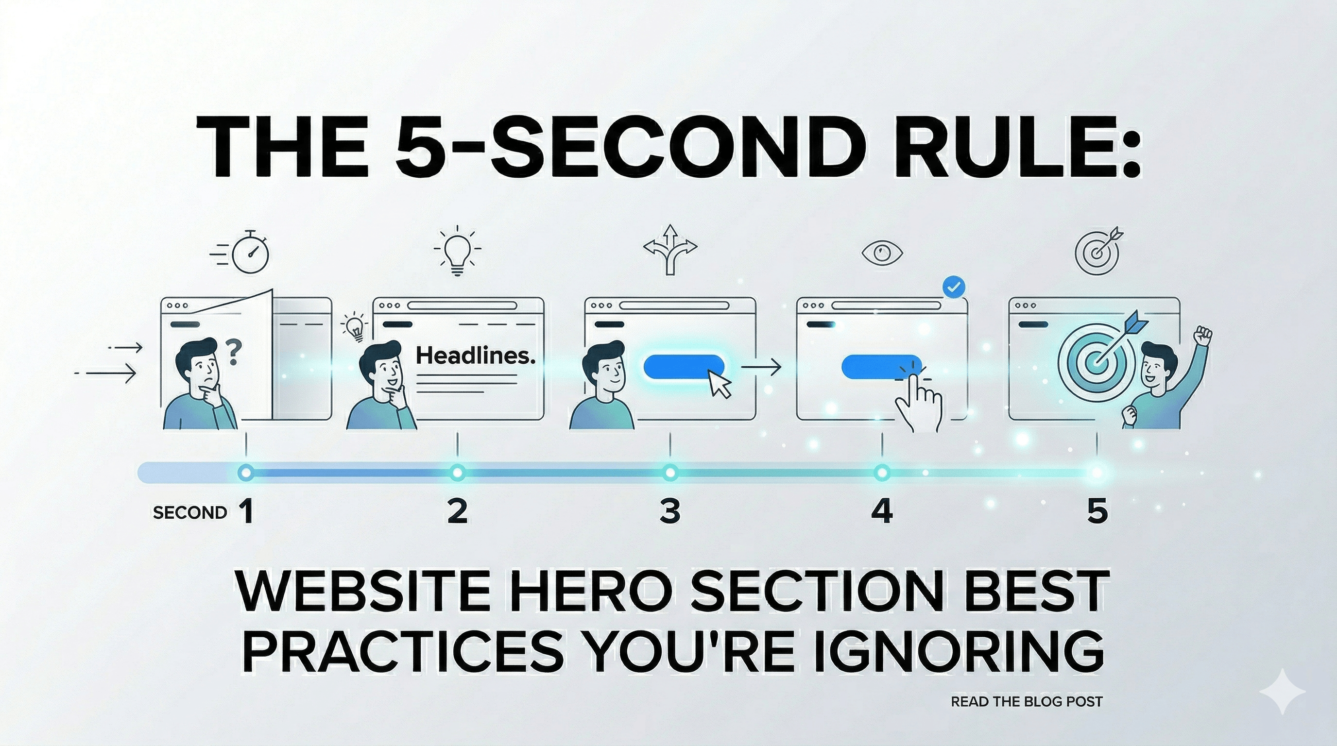
When a visitor lands on your SaaS landing page, you have approximately five seconds to convince them to stay. If they can't figure out what you do, who you do it for, and why they should care before scrolling, they will bounce. Because of this, mastering Website hero section best practices isn't just about making things look pretty—it's about survival.
For SaaS founders, indie hackers, and agency developers who are pouring blood, sweat, and caffeine into digital products, the top of the page is the single most valuable piece of digital real estate you own. Building an effective homepage hero means combining compelling copywriting with flawless technical execution. It is where your core value proposition meets user experience. If you get it right, your acquisition costs drop and your conversion rates soar. If you get it wrong, you bleed traffic to your competitors.
This guide pulls together everything you need to know about crafting that perfect first impression. We will dive deep into fundamental hero design principles, break down the exact anatomy of what makes a hero convert, look at some top-tier hero examples from the biggest players in tech, and give you technical, actionable advice that you can ship today.
Whether you are launching a micro-SaaS over the weekend or redesigning an enterprise client's main funnel, by the end of this guide, you will know exactly how to structure, test, and deploy a layout that grabs attention and gets visitors clicking your primary call-to-action out of sheer excitement.
Key Takeaways
Clarity First: Say exactly what your product does without corporate jargon.
Speed is King: Optimize for Core Web Vitals to keep your users from bouncing.
Social Proof: Trust signals like customer counts above the fold reduce friction.
Directional Cues: Guide the user's attention visually straight to your CTA.
Use Pre-Built UIs: Leverage standardized UI components instead of starting from scratch.
Table of Contents
- Anatomy of a High-Converting Homepage Hero
- 7 Website Hero Section Best Practices for SaaS
- 5 High-Converting Hero Examples to Inspire You
- Common Hero Design Mistakes to Avoid
- How to A/B Test Your Hero Layouts
- Frequently Asked Questions
- Ready to Ship Your UI?
Anatomy of a High-Converting Homepage Hero
Before we jump into the best practices, it is crucial to understand the fundamental building blocks of a successful homepage hero. A great hero is never just a randomly placed gradient background with some text overlaid on top of it. It is a highly calculated, structured module that is designed with commercial intention and is a foundational part of SaaS landing page best practices.
If you strip away the branding, the bespoke typography, and the fancy Framer Motion animations, almost every high-performing SaaS hero shares these core architectural components:
1. The Main Headline (H1 + Core Value Proposition)
Your H1 heading is the most important element on your entire website. It needs to tell the user exactly what your product is and what massive problem it solves instantly. It should be punchy, highly benefit-driven, and hyper-relevant to the search intent of the user. If they clicked an ad for "backend databases," your H1 better promise the best backend database experience imaginable.
2. The Supporting Subheadline
While the headline grabs the attention, the subheadline provides the necessary context to keep it. This is typically a single sentence or a short 2-3 sentence paragraph directly under the main headline. It explains how you deliver the promised value from the headline and clarifies who your product is explicitly built for.
3. The Primary Call-to-Action (CTA)
If your headline and subheadline successfully generate interest, your CTA is what channels that interest into measurable business action. It needs to stand out visually from the rest of the page, offering a clear, entirely frictionless next step. Phrases like "Start for free," "Get early access," or "Install via npm" are typically highly effective for developer-focused tools.
4. High-Quality Visuals
The human brain can process full images with incredible speed—in as little as 13 milliseconds. Your visual element—whether it is an application UI screenshot, a short animated product walkthrough video, or a sleek, stylized graphical representation of your architecture—must explicitly support your copy. The visual should give the user a tactile, tangible feel for what your software looks, feels, and acts like in production. Getting this visual language right is the secret to how to make your website look premium.
5. Social Proof Elements
Adding trust indicators directly below your CTA button (or subtly interwoven into the background design) significantly boosts credibility, especially for new indie hackers. Think of small, subtle text like "Trusted by 5,000+ developers" or a horizontal marquee of recognizable tech company logos.
7 Website Hero Section Best Practices for SaaS
Now that we know the anatomy, let's explore how to put these pieces together optimally to maximize conversions. Implementing these seven practices will ensure your hero design drives tangible, measurable business results.
1. Prioritize Clarity Over Cleverness
It is far too easy to get caught up in marketing jargon when describing your life's work. Phrases like "Synergistic paradigm alignments for the modern decentralized workforce" might sound brilliantly sophisticated to your internal team, but they completely alienate your users. Instead, be deadly precise. If your SaaS helps developers deploy code faster, just say: "Deploy your Next.js applications in 3 seconds."
When you prioritize extreme clarity, you drastically reduce the cognitive load required for the user to understand your product. A visitor should never have to guess what your software actually does.
2. Leverage Social Proof Above the Fold
When indie hackers and SaaS founders are trying to convert cold traffic—visitors who have never heard of your brand before today—trust is the highest barrier to entry. Placing verifiable social proof immediately visibly in the hero area is one of the absolute quickest ways to artificially manufacture trust.
You can implement this in several highly effective ways:
- A slow-moving horizontal marquee of client logos ("Trusted by engineering teams at...").
- A raw, impressive, integer-based statistic ("Join 103,452+ builders").
- A brief, highly impactful star rating cluster or a short quoted testimonial from an authority figure in your specific niche.
3. Use Interactive and Animated Elements (Thoughtfully)
Animations can magically bring a hero to life, instantly catching the user’s eye and demonstrating product value dynamically. Micro-interactions, spring-based hover states, and smooth entrance animations (like a subtle stagger fade-in using Framer Motion or GSAP) make a site feel incredibly premium and reliable.
However, interaction must serve a distinct purpose. Don't add heavy parallax scrolling, interactive particle fields, or massive 3D WebGL canvases just because they look cool—if they distract from the primary CTA, they are actively hurting you. If you choose to use animations, ensure they run at a locked 60fps, are computationally lightweight, and emphasize the product's core value. For developers, a simulated terminal typing out a setup script is infinitely better than a spinning 3D cube. For a technical deep-dive, read our guide on building animated hero sections for React.
4. Optimize for Blistering Fast Load Times
You can have the most beautiful, meticulously crafted homepage hero in the world, but if it takes 6 full seconds to load on a 4G connection, your visitors have already clicked the back button. Your Largest Contentful Paint (LCP) metric is absolutely critical here. Web performance is fundamentally a UX metric.
To ensure your hero loads almost instantly:
- Prioritize and preload your critical hero images using
<link rel="preload">. - Use modern, highly compressed formats like WebP or AVIF instead of unoptimized PNGs.
- Inline critical CSS specifically for the hero area to avoid render-blocking fetches.
- Avoid relying on heavy client-side JavaScript (like large React bundles) just to paint the initial text of the hero. Server-Side Rendering (SSR) is your best friend here.
5. Stick to a Single, Focused Primary CTA
A very common UX trap is falling into the "paradox of choice." Giving your users too many equal-weight options ("Read the blog," "Watch a video walkthrough," "Sign up for free," "See enterprise pricing") completely paralyzes their decision-making process.
Your hero should have one—and only one—dominant, undeniable goal. If your primary goal right now is to get free trial sign-ups, make that specific button the boldest, most vibrant, highest-contrast element on the screen. If you feel you absolutely must have a secondary CTA (like "Read documentation"), make it visually subordinate by using a transparent outline button style or a simple, unadorned text link.
6. Implement Clever Directional Cues
Directional cues are subtle visual hints that subconsciously guide the user's eye exactly toward your most important elements—which, 99% of the time, should be your CTA or your primary headline.
These cues can be entirely explicit (like a literal hand-drawn arrow pointing to a button, or a person in a background photo looking directly at the sign-up form) or implicit (like converging leading lines in your background graphic, a gradient that fades toward the center, or the strategic use of contrasting negative space). Exceptional hero design purposefully dictates exactly where the user looks first, second, and third.
7. Design Mobile-First, Not Mobile-As-An-Afterthought
It is a documented fact that over 50% of global web traffic comes from mobile devices, yet many agency developers and designers still design their heroes on massive ultrawide monitors and crudely squeeze them down at the last minute using a few media queries.
A mobile hero needs drastically adjusted typography scales (so large words don't awkwardly break across lines), properly cropped images (or completely hidden visuals if they take up too much vertical space and push the button out of view), and full-width, thumb-friendly CTA buttons with large hit areas. Ensure your text remains completely legible and that your core value proposition doesn't get buried endlessly below the mobile fold.
(Looking for more ideas? Explore these 12 SaaS website inspiration examples before you finalize your hero design.)
Common Hero Design Mistakes to Avoid
While striving for visual and conversion perfection, be incredibly careful not to fall into these frustratingly common pitfalls that can quietly, persistently tank your conversion rates.
The Carousel and Slider Overload
Image sliders and rotating carousels in the main hero area are notorious conversion killers. Industry data consistently shows that users rarely ever click past the first slide. Sliders violently dilute your primary message because users never know what the main point is. They also cause layout shifts (ruining your Core Web Vitals) and generally confuse visitors who are trying to scan quickly. Pick your strongest, most compelling single message and aggressively commit to it.
Vague, Jargon-Heavy Value Propositions
If a visitor reads your primary H1 and immediately has to say "Wait, what does that actually mean?" you have already lost them. Startups often try desperately to sound bigger than they are by using abstract, dense enterprise terminology. Strip out empty words like "revolutionary," "empowering," "turnkey," and "synergistic." Be relentlessly literal.
Poor Contrast and Accessibility Issues
Overlaying thin white text directly onto a busy, unedited background photograph is a classic, amateur design mistake. If your text isn't easily readable by someone with imperfect eyesight, your message isn't being received at all. Always ensure your text contrast ratios meet strict WCAG accessibility standards. If you absolutely must use a background photo, apply a dark overlay gradient completely behind the text to make it definitively pop.
How to A/B Test Your Hero Layouts
You cannot guess your way to a highly optimized homepage hero; you have to test it. A/B testing allows you to systematically turn subjective design debates into objective, data-driven decisions.
To run an effective A/B test on your hero:
- Change only one variable at a time. If you change the headline, the background image, and the button color all in the same test, you will have absolutely no idea which change actually caused the lift (or drop) in conversions.
- Start with high-impact elements. Do not waste your first 30 days testing whether a button should be a #0000FF blue or a #0000EE blue. Test completely different value propositions in your H1. Test a video background vs. a static illustration. Test offering a "Free Trial" vs. "Book a Demo".
- Commit to statistical significance. Do not end a test after getting 50 clicks. Use a proper testing calculator to determine how much traffic you actually need to be mathematically confident that version B is actually better than version A.
Frequently Asked Questions
Understanding the deep nuance of hero sections can be tricky, so let's address some common questions that developers and founders frequently ask.
What is the ideal size for a homepage hero image?
There is no single "perfect" size, but a highly safe baseline for desktop background images is roughly 1920x1080 pixels, saved aggressively as a modern WebP or AVIF file strictly under 200KB. You should tightly ensure the aspect ratio scales gracefully across mobile dimensions using CSS object-fit: cover.
Should a website hero section always have a button? In almost all commercial scenarios, yes, absolutely. The hero section represents your singular best opportunity to capture user intent while their motivation is at its absolute peak. A clear CTA button explicitly channels that intent; without it, impatient users are left aimlessly wondering what they are supposed to do next.
How does hero design impact SEO? It has a definitively massive impact on your rankings. From a technical performance standpoint, a slow-loading, unoptimized hero directly drops your Core Web Vitals, which Google aggressively uses as a ranking factor. From a content standpoint, prioritizing your H1 tag with semantic keywords and reducing rapid bounce rates through high engagement directly benefits your long-term organic search visibility.
Ready to Ship Your UI?
Crafting the perfect first impression requires an incredibly careful balance of persuasive copywriting, deep psychological design principles, and rigorous technical performance optimization. It involves endless iteration, aggressive A/B testing, and constant tweaking to find the exact combination of words and visual structure that make your target audience click with zero hesitation.
But you do not have to build it all from absolutely scratch, constantly reinventing the wheel on every new client project.
If you are a SaaS founder, an indie hacker, or a busy developer ready to ship your next landing page without the frustration of manual tweaking:
- Stop Wasting Time: Avoid 40+ hours of custom CSS and breakpoint troubleshooting.
- Ready-Made UIs: Access a massive toolkit of professionally architected, high-converting hero sections.
- Modern Stack: Fully optimized for React and Tailwind CSS.
- Premium Design: Get a state-of-the-art look that usually requires a senior design team.
Stop searching for Tailwind CSS premium templates and start shipping actual products today with ogblocks.
Written by Karan
Karan is a React engineer and the founder of ogBlocks, building high-performance UIs for SaaS.