
The Hidden ROI When You Display Technical Features Visually
SaaS founders, indie hackers, and web agency owners know the struggle: you built a powerful tool with amazing architecture, but when you explain it on your landing page, users scroll past the wall of text. You need to display technical features visually.
This guide shows how to transform complex backend capabilities into intuitive visual stories. It will help you improve user onboarding, increase landing page conversion rates, and build a premium feel through effective design visualization.
TL;DR: Key Takeaways
Visuals Win: Visitors spend an average of just 54 seconds on a page, making visual communication essential for complex technical products.
Data Visualisation Design: Use interactive architecture diagrams, code snippet comparisons, and workflow visualizers to explain abstract concepts.
Conversion Impact: Well-designed visual components reduce cognitive load and build trust, which can dramatically increase landing page conversion rates and user onboarding success.
Table of Contents
- The Challenge of Explaining Complex Software
- Why Data Visualisation Design Matters for SaaS
- Key Principles of Design Visualization
- 5 Proven Ways to Display Technical Features Visually
- Overcoming the "SAP Problem": Why Legacy UX Fails
- How to Implement Visual Features Quickly with ogblocks
- Frequently Asked Questions (FAQ)
The Challenge of Explaining Complex Software
You engineered a revolutionary database indexing algorithm or API platform. The engineering is flawless, latency is non-existent, and it solves a massive pain point. But how do you sell it?
Listing "O(1) time complexity" or "asynchronous parallel processing" as text bullets loses 90% of non-technical buyers immediately. Even technical buyers like CTOs and lead developers scan your page rapidly to see if your product solves their problem. They don't have time to read technical essays.
Behavioral analytics show that visitors spend an average of just 54 seconds on a web page, leaving no time for deep reading. Combine that with the fact that MIT researchers discovered the human brain processes entire images in as little as 13 milliseconds.
If competitors use interactive graphics while you use dense paragraphs, you lose conversions. Display technical features visually so your value proposition is absorbed instantly.
Why Data Visualisation Design Matters for SaaS
Data visualisation design isn't just about pie charts and bar graphs. It's about translating abstract data, complex system states, and technical flows into a format the brain processes intuitively.
Reducing Cognitive Load
Cognitive load is the mental effort required to understand your interface. Text-heavy descriptions force users to parse sentences, visualize abstract concepts, and evaluate their utility. Visuals do this heavy lifting.
Forrester Research found that better UI design and visual communication can yield up to a 200% increase in conversion rates. Displaying technical features visually reduces the friction between "What does this do?" and "I need to buy this." Users don't have to imagine how data flows when they can see it happening on screen.
Building Trust Through Premium Aesthetics
In the modern web, aesthetics correlate strongly with perceived trustworthiness and product quality. If your marketing site looks like a basic, unstyled template with raw HTML lists describing features, users will unconsciously assume your backend code is similarly haphazard. High-quality design visualization acts as a signal of engineering excellence.
When enterprise clients evaluate software, they are looking for stability and polish. A beautifully animated feature section tells them, "We care about the details."
Key Principles of Design Visualization
Here are the ground rules for creating effective feature visuals. Do not just slap stock photos or generic charts onto a page.
1. Keep It Contextual
Avoid showing a generic dashboard screenshot that scales down to become unreadable. Highlight the specific part of the UI or system performing the feature. If you're showing off a new "Automated Workflow" feature, blur the rest of the interface and highlight the workflow path. Zoom in on the interaction that matters.
2. Interactive over Static
Static images work, but interactive micro-animations perform better. If your tool synchronizes databases, show a subtle animation of data packets moving from Database A to Database B. Motion draws the eye and explains functionality over time. Modern CSS and libraries like Framer Motion make this easy.
3. Clear Visual Hierarchy
When displaying complex systems, establish a clear hierarchy. Use size, color contrast, and spacing to guide the eye to the most important element. For example, the main "Trigger" in an integration should be visually distinct from subsequent "Actions" using brighter colors or thicker borders.
5 Proven Ways to Display Technical Features Visually
Here are five highly effective patterns top-tier SaaS companies use to display technical features visually on landing pages.
1. Interactive Architecture Diagrams
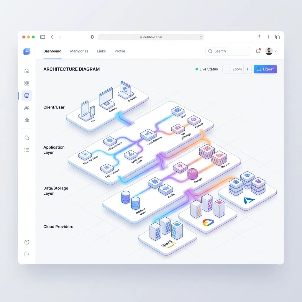
If you sell infrastructure, DevOps tools, or complex enterprise software, standard screenshots won't work since your product lacks a traditional UI.
Build interactive architecture diagrams instead. Show how your product sits between user servers and the public internet. Use glowing lines to indicate traffic flow and pulse animations to show latency improvements.
Pro Tip: Let users hover over nodes in the diagram to view tooltips explaining what happens at each layer.
2. Code Snippet Comparisons with Live Previews
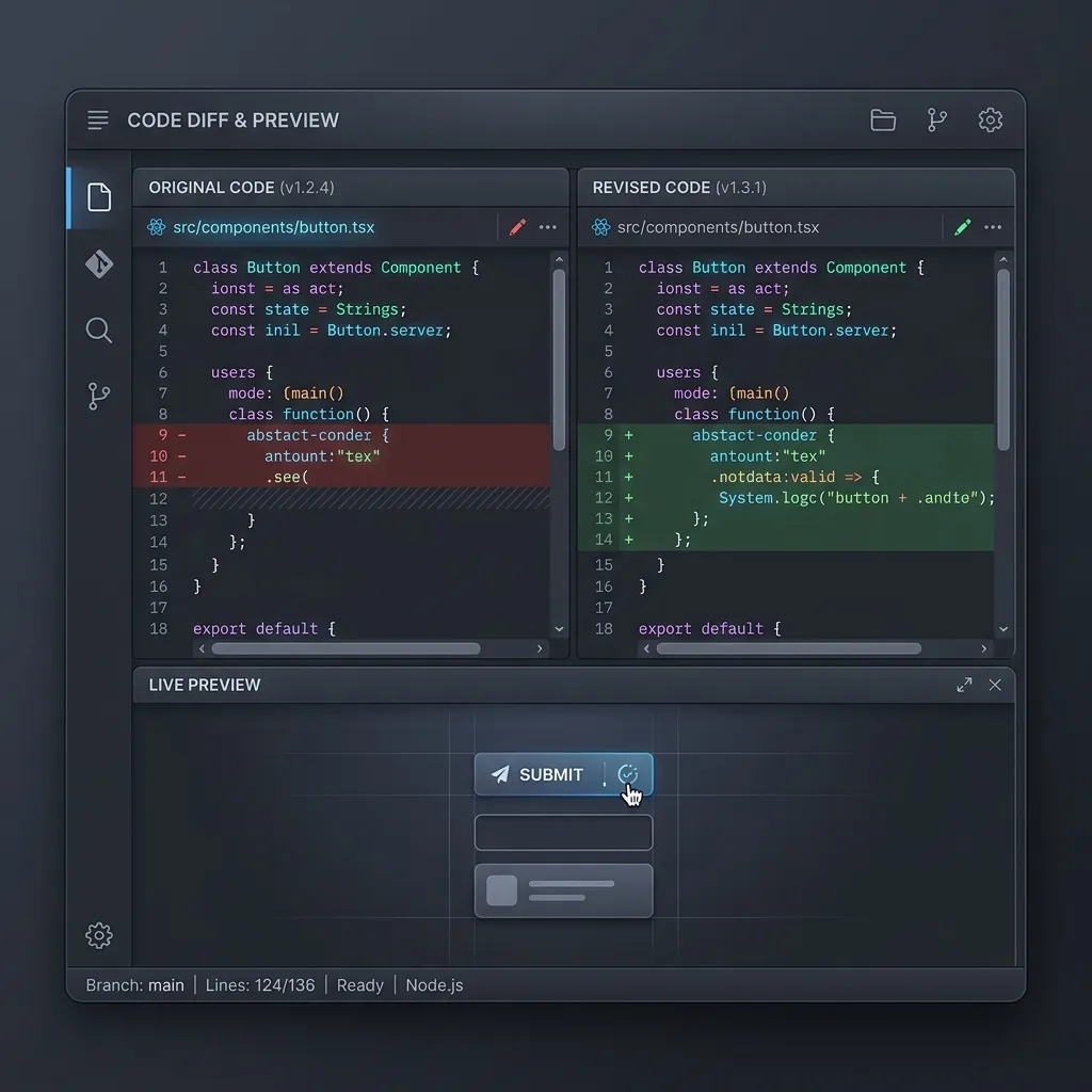
For developer-focused tools like APIs, SDKs, or libraries, the "visual" is often the code itself. A plain block of text is boring.
Use side-by-side comparisons. Show the "Old Way" (15 lines of messy code) on the left and "Your Product Way" (3 lines of clean code) on the right. Add a live preview pane that updates in real-time as users toggle different syntax options. This design proves your product's value instantly to engineers.
3. Node-Based Workflow and Pipeline Visualizers
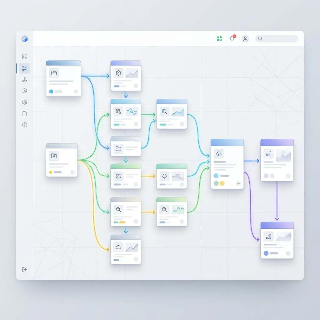
If your software automates tasks, use a node-based pipeline visualizer. Show a card representing a "New Lead," and draw a physical line connecting it to "Send Welcome Email" and "Update CRM."
By visualizing the logic, users immediately grasp the flexibility and power of your automation engine. HubSpot data shows that landing pages with visual feature demonstrations convert at an 86% higher rate.
4. Abstracted Dashboard Micro-Interactions
Instead of placing a massive, unreadable screenshot of your entire analytics dashboard, create a stylized, abstracted version of it. Strip out the real text and replace it with clean geometric shapes or blurred placeholder text.
Then, animate a specific interaction. Show a cursor moving to a dropdown, clicking it, and the chart below it instantly re-rendering. This demonstrates speed and usability without overwhelming the user with irrelevant data.
5. Real-Time API Response Visualizers
If you sell data, show how clean and structured it is. Create a split-screen view: on one side, a visually appealing UI card (like a user profile), and on the other side, the raw JSON response that powers it. As the user hovers over a JSON key (e.g., "user_score": 98), highlight the corresponding visual element on the UI card.
This bridges the gap between the technical backend and the end-user experience perfectly.
Overcoming the "SAP Problem": Why Legacy UX Fails
Look at legacy enterprise software to understand the value of modern design visualization. Consider common frustrations in massive legacy ERP systems like SAP.
Browsing developer forums or Reddit threads (like r/SAP discussions on seeing technical values in a dropdown) reveals users struggling with obtuse UIs. In legacy systems, users navigate hidden settings, click confusing buttons, and hunt through options just to expose a backend technical key.
Forcing users to dig for technical clarity creates a hostile experience. Bringing technical features out of the dark and displaying them intuitively positions your SaaS as the modern, user-friendly alternative to industry dinosaurs.
How to Implement Visual Features Quickly with ogblocks
Knowing how to display technical features visually is half the battle. The real challenge is implementing these interactive, polished components on your own site.
Building custom interactive node-graphs, code-comparison toggles, or animated dashboard abstractions from scratch easily consumes 40 to 80 hours of development time. For indie hackers or web agencies juggling multiple client projects, that time is too expensive.
This is exactly why you need ogblocks.
What is ogblocks?
ogBlocks is a premium, production-ready component library designed specifically for modern SaaS startups and web agencies. It provides an extensive collection of meticulously crafted React components that help you build stunning, high-converting interfaces in minutes, not weeks.
Why Choose ogblocks for Design Visualization?
- Plug-and-Play Feature Visualizers: ogblocks includes pre-built, highly customizable components specifically designed for displaying technical features. From animated code blocks and interactive flowcharts to stylized dashboard mockups, it's all ready to use.
- Premium Aesthetics: Every block is designed with modern web trends in mind. Think subtle glassmorphism, smooth Framer Motion animations, and perfect typography. You instantly elevate your brand's perceived value.
- Optimized for Conversion: These components aren't just pretty; they are strategically built using the design visualization principles we discussed. They are optimized to guide the user's eye and communicate value clearly.
- Developer Experience: Built with clean, accessible, and fully typed code. Integration is seamless, allowing you to focus on your core product logic instead of wrestling with CSS animations.
Stop wasting weeks trying to build complex visual components from scratch. Let your engineering team focus on your backend, and let ogblocks handle your frontend presentation.
Frequently Asked Questions (FAQ)
How do you visually represent technical data?
To visually represent technical data, you should abstract the complexity into intuitive UI patterns. Use interactive architecture diagrams, code snippet comparisons, workflow node graphs, and stylized dashboard micro-interactions. The goal is to highlight the value and outcome rather than the raw data itself.
Why is data visualisation design important for SaaS?
Data visualisation design is critical for SaaS because it reduces cognitive load. Users read very little text on landing pages. By displaying complex features visually, you help potential buyers instantly understand your product's value proposition, which directly increases trust and conversion rates.
What are the best tools for design visualization in web development?
For web development, the best tools combine React with modern animation libraries like Framer Motion or GSAP. However, building these from scratch is time-consuming. Premium component libraries like ogblocks are the best solution, offering pre-built, highly aesthetic visualization components ready for deployment.
Learning how to display technical features visually is one of the highest ROI skills a SaaS founder or agency owner can master. Moving away from dense paragraphs and embracing interactive data visualisation design communicates your product's value instantly and memorably.
Competitors might have good software, but the company communicating its features the best wins the market.
Don't let poor presentation hide brilliant engineering. Upgrade your marketing site today. Grab your license for ogblocks and start building beautiful, high-converting feature sections in minutes.
Written by Karan
Karan is a React engineer and the founder of ogBlocks, building high-performance UIs for SaaS.